
Digital Media Design · Bronx International High School
The Digital Path
A Photoshop & Design Fundamentals Study Book
5 chapters · 12 lessons · every term testable on the real exam
Digital Media Design · Bronx International High School
A Photoshop & Design Fundamentals Study Book
“The Digital Path” was written by a Digital Media Design teacher at Bronx International High School for his own students, and is provided to them entirely free of charge. It is a rewrite of an earlier classroom book, “The Digital Way,” rebuilt from the ground up against the current Adobe Certified Professional exam and modern Photoshop — the original book's structure and teaching approach are preserved, but every domain, tool, and exam detail has been checked, corrected, and updated where it had gone out of date. This book and the companion class website are both published online, free, for any other teacher or student who can use them.
You are free to copy, share, print, and adapt this book and its companion website, for any educational purpose, at no cost to anyone — on the following conditions:
Every fact, tool description, and exam detail in this book was checked against a real, named source rather than invented — full citations for every chapter are collected in the Sources & References section at the back of the book.
This edition replaces an older Photoshop study book written for a 2013–2017 exam that no longer exists. Every chapter here is rebuilt against the real, current Certiport blueprint — and where the older material got something wrong or out of date (a made-up term for a Pen tool feature, a stale exam-format description, tools that didn’t exist yet), this edition says so directly rather than quietly patching it. Chapters 1–2 are concept-only, no computer needed. Chapters 3–5 are hands-on: open Photoshop and follow along.
Chapter One
01
No software needed — everything here is concept and practice. It's also the first domain of the exam, and it matters more than people expect: a technically flawless Photoshop file can still fail a client, an employer, or an exam task if the thinking in this chapter is missing.
Before you open Photoshop, you're already doing design work. Every real project — a school club poster, a business's flyer, a client's ad campaign — starts the same way: someone needs something made, for a reason, for a specific person or group of people to see. Get that part wrong, and no amount of tool skill fixes it.
Every image or design choice has a purpose — a reason it needs to exist — and a target audience it needs to reach. Before opening any tool, a professional designer answers three questions:
Skip these questions and you can still end up with something that looks professional — clean layout, good color, sharp type — and still completely misses the mark, because it wasn't built for the right person. A flyer selling luxury watches to retirees uses different words, images, and even fonts than one selling the same watches to 20-somethings on social media. The product might be identical; the design should not be.
Purpose
The reason a design or image exists — what it needs to communicate or accomplish.
Audience
The specific group of people a design is created for.
Demographics
Measurable traits used to describe an audience — age, location, gender, income, interests, etc.
Before starting any real client project, a designer runs an interview — a structured conversation that gets the client's actual needs on paper before a single pixel gets placed. Real client interviews cluster around four categories:
Notice that “distribution” comes up in the first conversation, not at the end. A poster meant for a bus shelter and a graphic meant for Instagram have different size, resolution, and even color-mode requirements — finding this out on day one saves real rework later.
A client tells you: “I need a poster for my bakery.” That's a purpose (advertise the bakery) but no audience yet. A real interview digs further: is this for people who already know the bakery, or people discovering it for the first time? Shop window (walk-by, weekly regulars) or a community Facebook page (scroll-by, first-timers)? The answer changes what the poster needs to say and show — a loyalty-focused “come back for your usual” reads completely differently from a first-impression “welcome, here's what makes us different.”
Purpose isn't only something you plan for — it's something you can feel, immediately, looking at any single image, before a word of copy is even read:

Find two real advertisements. For each, write its purpose, its target audience, and one demographic clue in the ad that reveals who it's for. Then pick one very specific new audience (“seniors ages 65+,” “kids ages 6–8”) and sketch an original mini-poster for a school club aimed only at that audience, labeling three choices and why each fits.
Once Chapter 3 has taught you to create a document and place images, come back and rebuild your mini-poster digitally: an 8.5×11in, 300 PPI, RGB document with two or three images representing your chosen audience, a title naming them, and three callouts describing their age range, interests, and one need the design should meet.
Designers rarely work alone. A real project starts with a client conversation — what do you need, who is it for, what's the deadline, what's the budget — and continues with regular check-ins so nobody is surprised when the deadline arrives. Professional communication means asking clarifying questions early, documenting decisions in writing, and giving and receiving feedback without taking it personally.
| Client | The person or business a designer is creating work for. |
| Feedback | Specific, actionable comments on a piece of work, meant to improve the next draft. |
| Scope | The exact work a project includes — and, just as important, what it does not include. |
| Design Comp | A polished, presentable draft of a design idea shown to a client for approval or feedback. |
Scope is worth sitting with, because it's easy to define wrong. Scope is not the client-communication plan, and it's not the document's dimensions — scope is the actual cost estimate and schedule that defines what work is (and isn't) included in a project. When a client casually asks “could you also just add a second version in a different color while you're at it,” that's a scope question, even though it sounds small. Answering it well means naming it: “That's outside what we originally scoped — happy to add it, here's what that changes about the timeline/cost.”
Scope creep is what happens when small additions like that pile up without ever being renegotiated — the project quietly grows past its original plan, and the timeline and budget quietly fail to keep up.
Before a client approves anything final, a designer typically pitches two or three rough design comps — not just one. Presenting a single design puts the client in a yes/no position, which produces vague feedback. Presenting two or three genuinely different directions puts the client in a comparing position — which produces feedback you can actually act on.
| Project Manager | Keeps everyone on task, tracks deadlines, and is usually the one person who communicates directly with the client. |
| Designer | Responsible for the actual layout, look, and feel of the piece. |
| Photographer | Responsible for any original photography the project needs. |
| Writer/Editor | Responsible for writing, then editing and proofreading, all text content. |
On a small team, one person often wears more than one hat — but naming the roles out loud prevents the classic failure mode where everyone assumes someone else is handling something and nobody actually is.
With a partner, write a “client intake script” — five questions you'd ask before starting a design. Role-play it: one partner is the client, the other asks and records answers. Swap and repeat with a different business, then give one specific, actionable piece of feedback.
Once you know your way around type and exporting, rebuild your client-brief template digitally: labeled fields for Project, Audience, Deadline, Budget, and Style Notes with consistent type settings throughout. Fill it out once with an invented scenario, then export it so it’s actually reusable.
Fill out each box with the correct definition of each term. Remember, these terms come back on quizzes and the exam.
Why does a professional pitch two or three design comps instead of one polished final version?
Name the four common team roles on a client project, and what each is responsible for.
Write a one-paragraph scope statement for an invented client project — state exactly what is included, and one specific thing that is not, so a future addition would clearly count as scope creep.
Copyright automatically protects almost anything the moment someone creates it — a photo, an illustration, a font, a piece of music. You cannot legally use someone else's protected work in a client project without permission, a license, or a Creative Commons/public-domain exception that specifically allows it.
| Copyright | The legal right of a creator to control how their original work is copied, shared, or used. |
| Fair Use | A limited legal exception allowing copyrighted work to be used without permission for commentary, criticism, or education. |
| Licensing | Legal permission, usually with specific conditions, to use someone else's copyrighted content. |
| Restricted Font | A font licensed only for certain uses (personal, not commercial) — check a font's license the same way you'd check a photo's. |
| AI-Generated Content | Content created by generative AI. Its copyright status is legally unsettled — get explicit confirmation of what you're allowed to do with it before paid client use. |
| Model Release | A signed permission from a person appearing in a photo, allowing their likeness to be used — separate from owning the photo itself. |
| Location Release | A signed permission to use images of a specific private property or restricted location. |
| Trademark | Legal protection for a brand's name, logo, or mark, so customers can't be confused about who made a product — a related but separate right from copyright. |
Logos and brand marks are a related but separate category: trademark, not copyright. A company's logo is protected so that customers can't be confused about who made a product — which is a different legal question from who owns the pixels. You'll recognize the mark below instantly; that instant recognition is the entire point of a trademark, and exactly why you can't casually reuse someone else's.

It's easy to assume that owning or licensing a photo automatically means you can use everything in it. It doesn't. If a photo shows a recognizable person, using their likeness commercially may require a model release — separate from any rights you have to the photo file itself. A stock photo license might cover the image; it doesn't automatically cover the person's or property's own separate rights.
Fair Use is the single most misunderstood idea in this section. It is a narrow legal exception — and it is not a blanket permission to use whatever you want just because a project feels educational or non-commercial. “I'm just a student” does not automatically make copyrighted use legal, and it especially doesn't apply once a design gets reused for a real client or paid product. When in doubt: licensed stock, a Creative Commons asset that actually covers your use case, or your own original work.
In 2008, street artist Shepard Fairey created the iconic “Hope” poster used throughout Barack Obama's campaign — built from a copyrighted Associated Press photograph, used without permission. The AP and Fairey ended up in court: the AP argued Fairey profited substantially from their image; Fairey argued he'd transformed it enough to fall under Fair Use. Both sides settled privately, sharing rights. The lesson: the line between transformative Fair Use and infringement is blurry enough that even a famous professional ended up in court over it. When your own use is anywhere near that line, license properly or ask first.
Read four short scenarios (write your own or use your teacher's). For each, mark Legal / Illegal / It Depends and justify in one or two sentences. Then hand-design a simple infographic explaining what one specific Creative Commons license allows and doesn't.
Once you can create a document and place images, rebuild your comparison digitally: one page, an original photo/graphic you made yourself next to a placeholder for a licensed stock image you’d need permission for. Add a properly formatted attribution caption under the licensed one, and a paragraph explaining the legal difference.
Fill out each box with the correct definition of each term. Remember, these terms come back on quizzes and the exam.
What's the difference between owning a photo file and owning the rights to a person shown inside it?
Why did Shepard Fairey's “Hope” poster end up in court, even though he clearly transformed the original photo?
Pick a real logo you see every day. Explain why you can't legally drop it into a client project without permission, even though you can see it for free everywhere.
Every chapter ahead assumes fluency with a small set of core image vocabulary — several later ideas (and several real exam tasks) hinge on knowing exactly what a term means before you can act on it.
Resolution
The amount of detail an image holds, often measured in pixels per inch (PPI) or dots per inch (DPI).
Raster Image
An image made of a fixed grid of pixels — loses quality when scaled up. Photoshop's native format.
Vector Image
An image made of mathematical paths — scales to any size with no quality loss. Illustrator's native format.
A raster image is stored as a grid of colored dots (pixels) — a mosaic of a fixed number of tiles. Zoom in far enough and you see the individual tiles, blocky and undetailed. A vector image is stored completely differently: as mathematical paths and curves. A vector shape scaled to billboard size stays perfectly crisp, because the computer just redraws the same math bigger — there's no fixed grid to run out of.
This is exactly why Photoshop (raster) is still right for photographs — a camera captures a fixed grid of real-world light — while a logo is usually built as a vector, because it needs to work at business-card size and billboard size from the same file.
| Format | What it's for |
|---|---|
| .psd | Photoshop's native editable format, keeps every layer intact. Not a final deliverable unless the client needs to keep editing it. |
| .jpg / .jpeg | Compressed raster, good for photos, no transparency. |
| .png | Raster with transparency — the standard for a logo/graphic sitting on top of something else. |
| Standard for print-bound or finished, non-editable documents. | |
| .ai / .svg | Vector formats for logos and illustrations that need to stay scalable. |
On graph paper, color individual squares to build a simple picture out of visible “pixels.” Next to it, draw the same picture with only smooth lines and curves, no grid. Label them Raster/Vector with one-sentence definitions, then redraw a small section of each 3× bigger and notice which gets blocky.
Once you’ve used Free Transform (Ch. 3) and the Shape/Pen tools (Ch. 4), prove your paper prediction: place a photo and Free Transform it up 400%, screenshot the pixelated result. Recreate a simple version as a vector shape, scale that up 400% too, and screenshot it — it should stay crisp. Combine both on one labeled canvas.
Every visual decision a designer makes — in Photoshop or anywhere else — gets judged against a shared, nameable vocabulary: the Elements (raw building blocks) and Principles (how those blocks get arranged). This chapter's real goal isn't memorizing a word list — it's training your eye to recognize good and bad design on sight, and explain why in specific terms.
Four raw ingredients every design is built from — before any principle arranges them:
Line
A mark connecting two points — straight or curved, it can point, lead, or divide.
Shape
An enclosed area, made by a line closing on itself or a change in color.
Color
The fastest way to grab attention or set a mood — full theory in Chapter 2.
Texture
The surface quality of a thing — real, or just implied by how it looks.
The same four ingredients, arranged ten different deliberate ways:
Hierarchy
Arranging elements so the eye is guided to the most important one first.
Contrast
A noticeable difference between elements, used to create emphasis.
Balance
Weighing empty space against filled space, or one element against another.
Movement
Using line, color, and repetition to lead the eye and create motion.
Unity
Every part of a composition belonging together, supporting one message.
Emphasis
Making one element stand out because it's the most important part.
Alignment
Lining elements up along a shared edge instead of scattering them.
Proximity
Grouping related items close together so the eye reads them as one.
Repetition
Repeating a design element consistently throughout a piece.
White Space
Deliberately empty area around elements — a tool for focus, not waste.
Balance specifically comes in three distinct, named forms:
Sketch a deliberately bad flyer — too much text, no hierarchy, misaligned. On a second sheet, redesign it applying at least three named principles, labeling each fix with an arrow.
Once Chapter 3 has taught you layers and alignment, recreate your “bad flyer” digitally, then duplicate and redesign it using what you’ve learned. Add a rationale naming the three principles you applied.
▸ Further learning: the Photoshop Training Channel is a free, extensive video library referenced throughout this book.
▸ Looking ahead: Chapter 2 stays concept-first but moves into the shared visual language every designer uses — Elements & Principles, typography, and color theory.
Chapter Two
02
Principles, Type & Color, and File Basics — the shared visual language every designer uses to build something that actually works, and Domain 1 of the exam, tested before a single Photoshop screen ever appears.
If Chapter 1 was about who you're designing for and why, this chapter is about the visual language itself — the building blocks you'll recognize in every piece of design you look at again, on purpose, once you know their names. Still no software required — you'll apply all of it for real starting in Chapter 3.
Design principles are the shared, nameable rules that separate a design that works from one that just has stuff on it. You don't need a formal art background to use them — you need to recognize each one on sight.
Repetition
An element repeating more than once throughout a design.
Contrast
The difference in color/value between foreground and background — the main thing that makes text readable.
Proximity
Placing related elements close together so their relationship is visually obvious.
Alignment
Lining elements up along a shared edge or axis instead of scattering them.
Scale
The relative size of an element compared to everything around it.
Harmony
Every part of a design relating to and complementing every other part.
Draw a line connecting each principle to the real example that uses it.
Repeating a color, font, or shape throughout a piece isn't a limitation — it's what makes a design read as one thing. A useful rule of thumb: aim to make a clear visual impression within about five seconds — that's roughly how long you actually have before attention moves on.
Contrast is the difference in color and value between your foreground (usually text) and background. Low contrast doesn't just look unpolished — it makes a design functionally harder to use.
Proximity and alignment show relationships without saying them: put a phone number next to an address if they belong together; line elements up along a shared edge or center to read as intentional. Scale is how big something is relative to everything around it — a larger title isn't decoration, it's using scale to establish hierarchy.
Harmony is the “does this all belong together” principle — repetition, contrast, proximity, alignment, and scale all working with each other, not against.

Alignment works through the exact same kind of spacing cue — not a label, not a rule, just where things sit relative to a shared edge:

For each of the six principles, find one real-life example done well and one done poorly. Explain what makes each work or fail.
In three or four sentences, explain why these six principles exist at all — what problem does a designer run into without them?
Fill out each box with the correct definition of each term. Remember, these terms come back on quizzes and the exam.
Why does low contrast make a design functionally harder to use, not just less attractive?
Looking at Fig. 2.1b and 2.1c: what specifically changed between the two dot groupings in each figure — and nothing else?
Find one real design (a flyer, an app screen, a product package) and identify which of the six principles it uses well, and which one it's missing.
Typography and color are two of the most powerful tools in a designer's kit — and two of the easiest to get wrong through simple carelessness.
Before comparing typefaces, it helps to know the actual parts of a letter — the same handful of terms show up constantly once you start looking for them.
| Baseline | The invisible line every character sits on — the ground floor of a line of type. |
| x-height | The height of a lowercase letter's main body, not counting any ascender or descender — literally the height of a lowercase “x.” A taller x-height reads as larger and more legible at small sizes, even at the same point size. |
| Cap height | The height of a capital letter, measured from the baseline. |
| Ascender | The part of a lowercase letter that rises above the x-height (the tall stem on b, d, h, k, l). |
| Descender | The part of a lowercase letter that drops below the baseline (the tail on g, j, p, q, y). |
Casually, people use “font” and “typeface” interchangeably, and Photoshop's own interface does too — but the precise distinction is worth knowing. A typeface is the overall design — “Helvetica,” for example. A font is technically one specific weight, style, and size within that typeface — “Helvetica Bold, 12pt” is a font; “Helvetica” the whole family is the typeface. The distinction comes from print history (a physical set of metal type was cast at one exact size), and while nobody will correct you for using them interchangeably today, exam material sometimes tests the precise definitions, so know both.
Most real typefaces ship as a family of related styles rather than one single font: Regular, Italic (a genuinely redrawn slanted design, not just a computer-skewed version) or Oblique (a mechanically slanted version of the Regular style), and a range of weights from Light through Regular, Medium, Semibold, Bold, and Black. Using a family's real Bold or Italic style — instead of Photoshop's simulated “faux bold”/“faux italic” buttons, which just stretch or thicken the Regular style artificially — produces noticeably cleaner results, especially in print.

| Serif | Fonts with small decorative strokes at letter-ends (e.g. Times New Roman). Traditional/formal. |
| Sans-Serif | Fonts without those strokes (“sans” = without). Clean/modern. |
| Display | Highly decorative fonts for large headings, never for body text. |
A hard rule worth keeping: use as few fonts as possible — two, at most three. Avoid novelty fonts (Comic Sans, Papyrus, Wingdings) in anything professional. Copyright still applies to font selection — a font is licensed work, not a free system default.
| Hierarchy | Organizing text by importance so a reader finds the most important information first. |
| Leading | The vertical distance between the baselines of lines of text. |
| Kerning | The amount of space between two specific letters. |
| Tracking | The amount of space applied evenly across a group of letters. |
Designers use the color wheel to build predictable, harmonious combinations:
| Scheme | On the color wheel |
|---|---|
| Monochromatic | One color, varied only in shade/tint/tone. |
| Analogous | Colors sitting next to each other. |
| Complementary | Two colors directly opposite each other. |
| Split Complementary | A base color plus the two adjacent to its complement — a small triangle. |
| Triadic | Three colors evenly spaced — an even triangle. |
| Tetradic | Four colors forming a rectangle. |
| Hue | The actual color itself (red, blue, green, etc.). |
| Saturation | The intensity/purity of a color. |
| Value | How light or dark a color is. |
| Color Mode | RGB (light-based, screens) or CMYK (ink-based, print) — see Chapter 3 for choosing. |
| Bit Depth | How many values each color channel can hold — higher means smoother transitions, larger files. |
| Gamut | The full color range a device/mode can display or print — a vivid RGB color can be impossible in CMYK's smaller gamut. |
| Histogram | A graph of how many pixels fall at each brightness level — a quick under/overexposure check. |
Using a free color tool (e.g. Adobe Color), build one real palette for each of the six harmony formulas, recording the exact HEX codes so each is reproducible — not “a green,” the specific green.
Chart Definition and “how do you establish it” for Hierarchy, Leading, Kerning, and Tracking. Then answer: should you limit how many fonts you use? Why?
Fill out each box with the correct definition of each term. Remember, these terms come back on quizzes and the exam.
Referring back to Fig. 2.3, write the five labeled parts of “bdgy” in order from top of the letters to bottom.
Pick a typeface installed on your computer. Type your own name at a large size, print or screenshot it, then trace and label its baseline, x-height, and any ascenders or descenders by hand.
Every image has technical properties beyond how it looks — its resolution and its file format — and choosing the wrong one for the job is a real, common, avoidable mistake.
Resolution (dimensions) is an image's width and height, generally in pixels. A handful come up constantly:
| Format | Width | Height |
|---|---|---|
| HD | 1920px | 1080px |
| 4K | 3840px | 2160px |
| 720p | 1280px | 720px |
| Letter paper | 8.5in | 11in |
| Normal photo print | 4in | 6in |
| Email header (typical) | 480px | 480px |
PPI (pixels per inch) measures image density, not raw size — higher PPI means finer detail, which is why print targets a much higher PPI than screen work (why, exactly, in Chapter 3).
A screen and a printing press don't produce color the same way, and an image's color mode is what tells software which one it's built for. RGB is additive — a screen starts fully black and adds red, green, and blue light on top of each other; stack all three at full strength and the result is white. It's the correct mode for anything that will only ever be viewed on a screen. CMYK is subtractive — a printed page starts fully white and cyan, magenta, yellow, and black ink each remove light from it; stack all four at full strength and the result is closer to black. It's the mode a commercial printer expects. The practical consequence: CMYK physically can't reproduce every color RGB can display, so a bright screen color can visibly shift once it's converted for print — a real reason to check color mode before a design ships, not after.
Bit depth is a separate setting from color mode — it controls how many distinct tone values each color channel can store, not which colors are available. 8-bit (the default, and normal for finished web/social images) stores 256 possible values per channel — plenty for a normal photo, but push a strong Curves or Levels adjustment far enough and gaps can appear as visible banding, especially in a smooth sky or gradient. 16-bit stores thousands of values per channel instead, giving heavy adjustments far more room before banding becomes visible — the tradeoff is a file that can be twice the size, for detail that's often invisible until specifically pushed hard in editing.
| Format | What it's for |
|---|---|
| .gif | Simple animation, limited color — small animated graphics, not photos. |
| .png | Transparency support — the standard for a logo/graphic on top of something else. |
| .jpeg / .jpg | Compresses well — the standard for photos, no transparency. |
| .tiff | Large files, flexible color — high-end print work. |
| .psd | Editable, keeps every layer intact. |
| RAW | Unprocessed camera data — most flexible, needs dedicated software. |
Gut-check: best quality regardless of size → TIFF/RAW. Fastest to load online → JPEG/PNG. Needs to animate → GIF. Needs transparency → PNG. Still editable → PSD.
Build a Pros/Cons chart for .gif, .png, .jpeg, .tiff, .bmp, and RAW. Which for best quality regardless of size? For flyers printed at school? For fast web upload? For animation?
An image is 1920px wide, printed at 6in wide — what PPI does that give? (1920 ÷ 6 = 320 PPI, comfortably above the 300 PPI print target from Chapter 3.)
▸ Further learning: the Photoshop Training Channel has free tutorials on color correction and typography.
▸ Looking ahead: Chapter 3 finally opens Photoshop itself — starting a document with the correct resolution and color mode.
Chapter Three
03
This is where the book stops being paper-and-concept and starts being hands-on — Domains 2 and 3 of the exam, and the actual daily work of a Photoshop-using designer. Every lesson from here assumes you have Photoshop open — read a step, then do it.
This chapter covers finding your way around Photoshop's workspace, the selection tools you'll use in nearly every project, and masks — one of the single most useful, most tested, and most misunderstood ideas in the whole application.
Every single project in Photoshop begins the exact same way: open the program, and create the file everything else will happen inside of. That one decision — made once, correctly, before a single pixel is touched — is worth understanding first.
File > New (Ctrl/Cmd+N) opens a dialog organized around a row of category tabs across the top — Photo, Print, Art & Illustration, Web, Mobile, and Film & Video — each preloaded with realistic starting presets for that kind of work, plus a Recent and a Saved tab for your own history. Pick any preset tile and the entire right-hand Preset Details panel updates to match it — but every one of those fields stays fully editable afterward, so a preset is a starting point, never a limitation.
The fields that matter most, and are worth knowing cold for the exam: Width and Height (with a units dropdown right next to them — inches, pixels, centimeters, and more, same list as the ruler units), Resolution (in Pixels/Inch — 300 for print, 72 is the traditional screen default though modern displays often warrant more), Color Mode (RGB Color for anything screen-bound, CMYK Color for anything headed to a commercial printer, plus a bit-depth dropdown next to it), and Background Contents (White, Black, Transparent, or the current background color swatch). An Orientation toggle and an Artboards checkbox (for managing multiple same-size canvases in one file) sit alongside Width/Height, and an Advanced Options disclosure below Background Contents hides a color profile and pixel aspect ratio setting most projects never need to touch.

Click Create, and the blank canvas that appears opens inside Photoshop's workspace — the interface around it can look intimidating at first: a toolbar down one side, a cluster of panels down the other, menus across the top. The rest of this section is a tour of exactly that.
That diagram is the idea, simplified. Here's the actual thing it's describing — a real Photoshop window, nothing cropped out:

| Panel | A movable, dockable window with a specific set of controls — Layers, Properties, Adjustments, Brushes, Character. |
| Layer | One independent, stackable piece of content — an image, shape, text, or adjustment. |
| Adjustment Layer | A layer that changes appearance without permanently altering any pixel — the core of nondestructive editing. |
| Rulers | Non-printing guides toggled with Ctrl+R (Cmd+R on Mac), used to measure and place elements. |
Before any panel or menu, the idea itself: think of a layer as one sheet of clear plastic film. A photo on one sheet, a logo on another, a line of text on a third — stack them and look straight down through all of them at once, and you see one combined image. Nothing on any single sheet touches or damages the sheets underneath it. Move the text sheet, and the photo underneath is completely untouched. That's the entire idea. Every single thing in a Photoshop document — a photo, a shape, a line of text, a color adjustment — lives on its own sheet, called a layer, and the Layers panel is just a list of every sheet currently in the stack, top to bottom.
Two things follow directly from this, and both matter constantly: order matters — a layer higher in the list sits visually on top of, and can hide, everything below it — and editing one layer never touches another, which is the entire reason Photoshop is safer to work in than a single flattened photo.
Every new layer is created the same handful of ways: the Create a new layer icon — a small square with a folded corner, bottom-right of the Layers panel — adds one instantly above whatever's currently selected; Layer > New > Layer… does the same from the menu, with a naming dialog first; and Ctrl/Cmd+Shift+N is the keyboard shortcut for either. To duplicate an existing layer exactly, select it and press Ctrl/Cmd+J — the fastest way to experiment on a copy without risking the original. To remove a layer, select it and either press Delete, or drag it onto the trash-can icon in the same bottom row.

The Layers panel lists every layer top to bottom in stacking order. Click a layer's eye icon to toggle visibility. A common mix-up: selecting a layer is not the same as selecting the content on that layer. Clicking a shape layer's name selects the layer — changing the foreground swatch does nothing until the shape itself is selected with its own tool, or you use the Properties panel's fill option. This trips up almost everyone the first time.
Every layer secretly has a Blend Mode — a rule for how its pixels mix with everything stacked underneath — and it's set from one specific place: the dropdown reading Normal at the very top-left of the Layers panel, directly above the layer list itself. Click it, and a single long menu opens with every blend mode organized into groups by what they do: a Darken group (Multiply, Color Burn, Linear Burn…) that can only make things darker; a mirror-image Lighten group (Screen, Color Dodge, Linear Dodge…) that can only make things lighter; a Contrast group — this is where Vivid Light lives, alongside Overlay, Soft Light, Hard Light, Linear Light, Pin Light, and Hard Mix — that pushes both ends at once; and smaller Comparative and Component groups at the bottom. Most of the time only three or four modes get used constantly — Multiply to darken, Screen to lighten, Overlay for contrast — but knowing the dropdown lives right there, and that the modes are grouped by effect, makes the other fifty stop being intimidating.

What each group actually does, one mode at a time — worth knowing cold, since the exam tests recognizing a mode from its effect, not just naming it.4
| Darken group — can only make things darker | |
|---|---|
| Darken | Keeps whichever pixel — top layer or the one below — is darker, channel by channel. |
| Multiply | Multiplies the two layers’ values together, always darkening; white becomes invisible, black stays solid black. The single most-used darkening mode. |
| Color Burn | Darkens and increases contrast at the same time, based on the blend color — more dramatic than Multiply. |
| Linear Burn | Darkens by decreasing brightness directly — a flatter, less contrasty darken than Color Burn. |
| Darker Color | Like Darken, but compares the combined RGB value as one number instead of channel by channel — never mixes channels from each layer. |
| Lighten group — the mirror image of Darken | |
|---|---|
| Lighten | Keeps whichever pixel is lighter, channel by channel — the exact opposite of Darken. |
| Screen | The lightening opposite of Multiply; black becomes invisible, white stays solid white. The single most-used lightening mode. |
| Color Dodge | Brightens and increases contrast based on the blend color — the lightening opposite of Color Burn. |
| Linear Dodge (Add) | Brightens by literally adding the two layers’ brightness values together — can blow out to pure white fast. |
| Lighter Color | Like Lighten, but compares combined RGB as one number — the Lighten counterpart to Darker Color. |
| Contrast group — pushes both ends at once | |
|---|---|
| Overlay | Multiplies dark areas, Screens light areas — punches up contrast while roughly preserving highlights and shadows. Extremely common for texture and light overlays. |
| Soft Light | A gentler version of Overlay — like shining a diffused spotlight on the layer below. |
| Hard Light | A stronger, harsher version of Overlay — like a harsh direct spotlight. |
| Vivid Light | Combines Color Burn (on darks) and Color Dodge (on lights) — more extreme, more saturated contrast than Overlay. |
| Linear Light | Combines Linear Burn and Linear Dodge — a flatter, more extreme version of Vivid Light. |
| Pin Light | Replaces pixels depending on the blend color’s brightness — produces a harsh, posterized-looking result, useful for special effects. |
| Hard Mix | Pushes every pixel to one of only eight extreme colors — the most aggressive Contrast mode, effectively posterizing the result. |
| Comparative & Component groups | |
|---|---|
| Difference | Subtracts one layer’s values from the other — identical pixels turn pure black, different pixels light up. A real diagnostic tool for checking if two images are actually the same. |
| Exclusion | Like Difference, but lower-contrast and softer — identical pixels still go black, but the rest looks gentler. |
| Subtract | Subtracts the top layer’s brightness from the layer below, darkening — can go straight to black fast. |
| Divide | Divides the layer below by the top layer, usually brightening — the mathematical opposite of Subtract. |
| Hue | Takes only the hue (the actual color) from the top layer, keeping the saturation and brightness of the layer below. |
| Saturation | Takes only the saturation (color intensity) from the top layer, keeping the hue and brightness below. |
| Color | Takes both hue and saturation from the top layer, keeping only the brightness below — the standard mode for hand-tinting a black-and-white photo. |
| Luminosity | Takes only the brightness from the top layer, keeping the hue and saturation below — the exact opposite of Color. |
A Layer Style (fx) — Drop Shadow, Stroke, Bevel & Emboss, Outer Glow, and more — is applied one of two ways, and the second is easy to never discover on your own. The first way: select a layer, click the fx icon at the bottom of the Layers panel (the same one from Fig. 3.1g), pick an effect from the menu that pops up, and the full Layer Style dialog opens with every option for it. The second way, much faster once a style already exists: drag the small “fx” badge that appears on the right side of a styled layer's row directly onto a different layer — this instantly copies the exact same style (identical settings and all) onto that new layer, no dialog required. This is how a designer applies one consistent drop shadow to twenty icons in seconds instead of setting it up twenty separate times.
Without looking back at the figures, sketch or describe where each of these lives in the Layers panel.
Where is the icon that creates a brand-new layer?
Where is the Blend Mode dropdown, and what does it say by default?
Which group of blend modes is Vivid Light part of — Darken, Lighten, or Contrast?
Name the two different ways to apply a Layer Style to a layer.
What keyboard shortcut duplicates the currently selected layer?
An adjustment layer holds a mathematical instruction applied to every layer beneath it instead of holding pixels — you can come back and change your mind completely, with nothing about the original image ever permanently altered. This is nondestructive editing: whenever there's a nondestructive way to make a change, prefer it. Creating one is a single click, from the Adjustments panel — a grid of icon buttons, one per adjustment type, each adding a new adjustment layer directly above whatever's currently selected:

What each of those adjustment types actually controls.4
| Adjustment | What it controls |
|---|---|
| Levels | Sets the exact black point, white point, and midtone (gamma) of an image using a histogram — the most direct way to fix flat, washed-out contrast. |
| Curves | The same idea as Levels but with a fully adjustable curve instead of three sliders — the most precise, most professional tonal and color tool in Photoshop. |
| Exposure | Simulates a camera’s exposure, offset, and gamma controls — built for photos that are genuinely over- or under-exposed. |
| Hue/Saturation | Shifts hue (the color itself), saturation (color intensity), and lightness — can target one color range at a time instead of the whole image. |
| Color Balance | Shifts the balance between color opposites (cyan–red, magenta–green, yellow–blue), separately in shadows, midtones, and highlights. |
| Black & White | Converts to grayscale with individual sliders per original color — unlike Desaturate, a red object and a blue object can end up completely different shades of gray. |
| Photo Filter | Simulates a warming or cooling colored glass filter placed over the camera lens. |
| Channel Mixer | Rebuilds each color channel (Red/Green/Blue) from a custom mix of all three — powerful, unforgiving, built for advanced color grading. |
| Color Lookup | Applies a preset color-grading “look” (a LUT, the same kind used in film color grading) in one click. |
| Selective Color | Adjusts the CMYK ink mix within one specific color range (reds, yellows, etc.) without touching the others — a print-industry standard tool. |
| Invert | Flips every color to its exact opposite — white becomes black, and so on. Also the basis of a negative-film look. |
| Posterize | Reduces the number of tonal levels in the image to a small, chosen number, producing flat color bands instead of smooth gradients. |
| Threshold | Converts the image to pure black and white only, with everything above one brightness cutoff going white and everything below going black. |
| Gradient Map | Remaps the image’s tones onto a chosen gradient — shadows take the gradient’s left color, highlights take its right color. The basis of most duotone and split-tone looks. |
| Vibrance | Boosts muted colors more than already-saturated ones, and specifically protects skin tones — a more natural alternative to a blanket Saturation boost. |
| Clarity / Dehaze | Clarity boosts midtone contrast for a punchier, more textured look; Dehaze cuts through atmospheric haze or fog. |
| Grain | Adds artificial film grain, with control over its intensity and size. |
| Light | A simplified, beginner-friendly bundle of the most common brightness and contrast controls in one panel. |
Draw a line connecting each adjustment to the problem it actually fixes.
One diagram to hold onto as a quick-reference summary of everything just covered — where the Blend Mode dropdown sits, what a Layer Group's folder icon looks like, and how the fx badge marks a layer with a Layer Style attached (more on masks specifically in 3.3):
Same four things, spotted in a real file:

Click either the foreground or background color swatch itself (bottom of the toolbar) and the full Color Picker opens — a genuinely precise way to set a color, not just an approximate one, with the exact same value expressed four different ways at once (HSB, RGB, Lab, and a hex code) so a color can be reproduced exactly on a different tool, a different document, or a printed swatch book:

The Brushes panel gets the same kind of dedicated dialog for painting tools — open it to fine-tune size, spacing, and texture before a single stroke gets made:

Zoomed back out, here's where all of these panels actually live together, in the default workspace:

Every panel can be rearranged: drag a panel's tab to dock it into a different group, drag it away entirely to float it as its own window, or click the X on its tab to close it. Lost a panel completely? Every single panel in Photoshop lives under the Window menu — a checkmark next to its name means it's currently open, and clicking it toggles that panel on or off. Made a mess of the layout? Window > Workspace > Reset Essentials snaps everything back to where it started, no undo history needed.

Photoshop also ships several purpose-built workspace presets — each one shows and arranges a different subset of panels for a different kind of work: Essentials (general use, the default), Graphic and Web, Motion (a Timeline panel for video/animation work), Painting (brush-heavy panels up front), and Photography (Histogram and Adjustments panels prioritized). Switch between them from the workspace switcher in the top-right corner of the Application bar, or from the Window > Workspace menu itself.

Rulers are not on by default — this is the single most common reason someone opens Photoshop and can't find them. Three things, in order, fix that completely.
Press Ctrl+R (Cmd+R on Mac). Or, if you'd rather click than remember a shortcut, open the View menu and click Rulers — exactly where it's circled below:

Once it's on, a thin strip appears along the top and left edges of the canvas, marked with numbers — that's the ruler:

The ruler might default to pixels instead of inches, which looks like huge, unfamiliar numbers if you were expecting inches. Fix it in one click: right-click directly on the ruler itself (not the canvas) and a small list of units pops up — click the one you want.
With rulers on, click directly on the ruler strip and drag onto the canvas — a thin blue line follows your cursor. Let go, and that's a guide: a non-printing line used to align content precisely, the digital version of a pencil line you'd erase later. Drag from the top ruler for a horizontal guide, the left ruler for a vertical one. This is the only way to place a single guide by hand — there's no menu button that does it for you.
For an exact position instead of eyeballing it, use View > New Guide and type a measurement directly — this is how Chapter 3.4's business card project places guides at exact fractions of an inch. View > Lock Guides stops you from accidentally dragging one out of place mid-project, and View > Clear Guides removes all of them at once. As a rule of thumb for which unit to work in: plan print work in inches or centimeters at a fixed resolution (300 PPI is the print standard); plan screen work in pixels.
Rulers and guides look like a minor interface detail, but recognizing what they're for — and the difference between a ruler and a guide — has been asked directly on past versions of this exam. Don't skip a topic just because it seems too basic to test.
Double-click directly on a layer's name in the Layers panel to rename it — get in the habit early. “Layer 47” tells nobody anything, including you, a week later. Select several layers at once (Ctrl/Cmd-click each one) and press Ctrl/Cmd+G to fold them into a Layer Group, which collapses to a single row and keeps a complex file organized the same way folders organize files on a computer.
Right-click any layer's row (not its name — the row itself) and a context menu opens with a Color submenu — tinting that layer's whole row one of seven colors. This is easy to skip past, but genuinely useful in a busy file: color every layer belonging to one part of a design (say, everything in a logo lockup) the same color, and it visually separates itself from the rest of the stack without needing a group.

Locking works two ways too: click the small lock icons directly in a layer's row for one-off toggles (transparent pixels / image pixels / position / all), or select several layers and use Layer > Lock Layers… (Ctrl/Cmd+/) to apply the same lock to all of them at once from a single dialog. Nearly everything this section covers — renaming aside — has a real home in the Layer menu itself:

The History panel (Window > History) lists every recent action as a numbered state, in order, back to when the file was opened — click an earlier state and the whole document jumps back to it. It's a second, visual kind of undo alongside the standard Ctrl/Cmd+Z. Unlike an adjustment layer, though, it isn't nondestructive: jumping back and then making a new edit permanently discards every state that came after it.
Create a new document and draw a simple shape. Turn on Rulers, switch units to centimeters, and drag out one horizontal and one vertical guide. Toggle the shape's visibility with the eye icon. Add a Brightness/Contrast adjustment layer and experiment — notice the shape itself never changes. Add text and explore the Character panel's kerning/tracking/leading. Rename every layer you created to something a stranger could understand.
That small triangle in a tool icon's bottom-right corner is the tell: it means more tools are stacked behind that one spot. Click and hold on the icon — or right-click it — and a fly-out menu opens listing every tool sharing that slot:

Click and hold on a tool carrying one, and this is what appears:

Build a full-size paper toolbar. On an 11×17 (or any long) sheet, draw Photoshop's toolbar exactly as it appears on your own screen, top to bottom. For each tool that has an extra fly-out menu — look for the small triangle in a tool icon's bottom-right corner, then click and hold on it to see what's hiding there — cut a small strip of paper and fold it into an accordion with one fold per hidden tool, then glue the accordion directly next to the tool it belongs to. Opening the accordion should reveal the hidden tools the same way clicking and holding on the real icon does. Label every tool with its name and a one-sentence function, working top to bottom in the order they actually appear:  Move ·
  Rectangular/Elliptical Marquee ·
  Lasso family ·
  Object Selection/Quick Selection/Magic Wand ·
  Crop ·
  Eyedropper · Healing/Spot Healing ·
  Brush/Pencil ·
  Clone Stamp ·
  History Brush ·
  Eraser ·
  Gradient/Paint Bucket ·
  Dodge/Burn/Sponge ·
  Pen ·
Pen ·  Type ·
  Path Selection/Direct Selection ·
  Shape tools ·
  Hand ·
  Zoom · the Foreground/Background color swatches · Quick Mask Mode at the very bottom. Don't hesitate to ask for help finding a tool — the goal is an accurate replica, not a fast one.
Map the menu bar. Fig. 4.1 (Chapter 4) shows the File menu opened, with Place Embedded highlighted. Do the same for every other top menu — Edit, Image, Layer, Type, Select, Filter, View, Window — by actually opening each one and sketching or screenshotting what's inside. For each menu, record: its three most useful commands for a beginner, one command you don't understand yet, and one keyboard shortcut worth memorizing. Combine all nine into a single reference sheet you keep for the rest of the course.
The project above asked you to find these yourself. Use this table to check your work afterward — not before. Same order as the real toolbar, grouped by fly-out family, with the keyboard shortcut for each family (press it repeatedly, or hold Shift and press it, to cycle through that family's tools). Every icon below is real, not redrawn.1
| Move & Artboard (V) | |
|---|---|
| Move | Moves the selected layer, group, or active selection’s content. |
 Artboard Artboard | Creates and manages artboards — same-canvas frames for designing multiple screen sizes or layouts at once. |
| Marquee (M) | |
|---|---|
| Rectangular Marquee | Draws a straight-edged rectangular selection. |
 Elliptical Marquee Elliptical Marquee | Draws a straight-edged elliptical or circular selection. |
 Single Row Marquee Single Row Marquee | Selects a single row of pixels, exactly one pixel tall, all the way across. |
 Single Column Marquee Single Column Marquee | Selects a single column of pixels, exactly one pixel wide, top to bottom. |
| Lasso (L) | |
|---|---|
| Lasso | Draws a completely freehand selection outline, following the cursor exactly. |
 Polygonal Lasso Polygonal Lasso | Draws a straight-edged selection, one click per corner. |
 Magnetic Lasso Magnetic Lasso | Snaps its outline to a high-contrast edge automatically as the cursor moves near one. |
| Object Selection (W) | |
|---|---|
| Object Selection | Drag a rough box around an object and Photoshop finds its precise edge automatically. |
 Quick Selection Quick Selection | Paint roughly over an area and the selection grows outward to the nearest edge as you go. |
 Magic Wand Magic Wand | Selects every connected pixel close to the color clicked, based on a Tolerance setting. |
| Crop (C) | |
|---|---|
| Crop | Trims the canvas to a new boundary, with a built-in straighten option for a tilted horizon. |
 Perspective Crop Perspective Crop | Crops and corrects a skewed or angled perspective in the same step — draw a non-rectangular boundary and Photoshop squares it up. |
 Slice Slice | Divides a design into separate rectangular pieces meant to be exported individually. |
 Slice Select Slice Select | Selects, resizes, or rearranges slices already created with the Slice tool. |
| Frame (K) | |
|---|---|
 Frame Frame | Draws a rectangular or elliptical placeholder that any image dropped into it is automatically masked to fit — a fast way to build a photo-grid layout. |
| Eyedropper (I) | |
|---|---|
| Eyedropper | Samples a color from anywhere in the document to set the new foreground color. |
 3D Material Eyedropper 3D Material Eyedropper | Samples a surface material from a 3D model, for use elsewhere on the same model. |
 Color Sampler Color Sampler | Places up to four permanent color-reading points on an image, tracked live in the Info panel. |
 Ruler Ruler | Measures exact distance and angle between two points you drag across. |
 Note Note | Attaches a text note to a specific spot in the document, visible to anyone else who opens the file. |
 Count Count | Manually numbers and tallies objects in an image. |
| Healing (J) | |
|---|---|
 Spot Healing Brush Spot Healing Brush | Paint over a small blemish and Photoshop automatically samples nearby texture to repair it — no source point needed. |
 Healing Brush Healing Brush | Like Clone Stamp, but blends the sampled texture’s lighting into the destination instead of pasting it exactly. |
 Patch Patch | Draw a rough selection around a problem area, then drag it over a patch of good texture to repair it. |
 Content-Aware Move Content-Aware Move | Select an object and drag it to a new spot; Photoshop moves it and fills in the gap it left behind. |
 Red Eye Red Eye | One click removes the red-eye effect from a flash photo. |
| Brush (B) | |
|---|---|
| Brush | Paints with the foreground color using a chosen brush tip. |
 Pencil Pencil | Paints hard-edged strokes with no softness — the Brush tool without anti-aliasing. |
 Color Replacement Color Replacement | Paints a new color over an existing one while preserving the original’s shading and texture. |
 Mixer Brush Mixer Brush | Simulates real paint — blending, mixing, and diluting colors on the canvas the way a physical brush would. |
| Stamp (S) | |
|---|---|
| Clone Stamp | Copies pixels from a sampled source point and paints them elsewhere, stroke by stroke. |
 Pattern Stamp Pattern Stamp | Paints with a repeating pattern instead of a sampled area. |
| History Brush (Y) | |
|---|---|
| History Brush | Paints an earlier History state back onto the current one — selectively undoing just where you paint. |
 Art History Brush Art History Brush | Same idea as History Brush, but paints in stylized, textured strokes instead of a clean restoration. |
| Eraser (E) | |
|---|---|
| Eraser | Erases to transparency (or the background color, on a locked layer). |
 Background Eraser Background Eraser | Erases a sampled color as you drag near an edge, automatically protecting the foreground. |
 Magic Eraser Magic Eraser | Erases every pixel matching the one clicked, in one click — the eraser equivalent of the Magic Wand. |
| Gradient & Paint Bucket (G) | |
|---|---|
| Gradient | Draws a smooth blend between two or more colors, in one of five styles (Linear, Radial, Angle, Reflected, Diamond). |
 Paint Bucket Paint Bucket | Fills an area of similar color with the foreground color or a pattern, in one click. |
 3D Material Drop 3D Material Drop | Applies a sampled 3D material onto another part of a 3D model. |
| Blur, Sharpen & Smudge (—) | |
|---|---|
 Blur Blur | Softens detail wherever painted over. |
 Sharpen Sharpen | Increases edge contrast wherever painted over — the opposite of Blur. |
 Smudge Smudge | Drags and smears pixels in the direction of the stroke, like a finger through wet paint. |
| Dodge, Burn & Sponge (O) | |
|---|---|
| Dodge | Lightens wherever painted, with a Range setting (Shadows/Midtones/Highlights) controlling which tones it affects most.5 |
 Burn Burn | Darkens wherever painted — the opposite of Dodge, with the same Range control. |
 Sponge Sponge | Increases or decreases color saturation wherever painted, depending on its Mode setting. |
| Pen (P) | |
|---|---|
| Pen | Draws precise vector paths, anchor point by anchor point. |
 Freeform Pen Freeform Pen | Draws a path by dragging freely, like a pencil, instead of clicking individual anchor points. |
 Curvature Pen Curvature Pen | Draws smooth curves automatically between clicks, no manual direction handles. |
 Add Anchor Point Add Anchor Point | Adds a new anchor point to an existing path without changing its shape. |
 Delete Anchor Point Delete Anchor Point | Removes an anchor point from an existing path. |
 Convert Point Convert Point | Converts a smooth, curved anchor point into a sharp corner, or the reverse, by dragging. |
| Type (T) | |
|---|---|
| Horizontal Type | Adds standard left-to-right text. |
 Vertical Type Vertical Type | Adds text that reads top-to-bottom. |
 Vertical Type Mask Vertical Type Mask | Types a vertical text-shaped selection instead of real text. |
 Horizontal Type Mask Horizontal Type Mask | Types a horizontal text-shaped selection instead of real text — useful for masking a photo into the shape of letters. |
| Path Selection (A) | |
|---|---|
| Path Selection | Selects and moves an entire path or shape as one object. |
 Direct Selection Direct Selection | Selects and drags individual anchor points and direction handles, reshaping a path point by point. |
| Shape (U) | |
|---|---|
| Rectangle | Draws a rectangular vector shape, with live corner-radius control in the Properties panel. |
 Ellipse Ellipse | Draws an elliptical or circular vector shape. |
 Triangle Triangle | Draws a triangular vector shape. |
 Polygon Polygon | Draws a straight-sided polygon, with the number of sides set in the options bar. |
 Line Line | Draws a straight vector line, with adjustable weight and optional arrowheads. |
 Custom Shape Custom Shape | Draws from a library of premade vector shapes — arrows, symbols, icons, and more — fully editable after drawing. |
| Hand (H) | |
|---|---|
| Hand | Pans around a zoomed-in document by dragging; hold Spacebar with any other tool active for a temporary Hand. |
 Rotate View Rotate View | Rotates the canvas view itself for a more comfortable angle — never rotates the actual document. |
| Zoom (Z) | |
|---|---|
| Zoom | Magnifies the view on click, or Alt/Option-click to zoom out; drag across an area to zoom to exactly that region. |
Without opening Photoshop, write which menu you'd click first for each task below. Then check yourself for real.
Change the canvas size without scaling the image.
Add a Layer Style (fx) like Drop Shadow to a layer.
Open the Color Range selection tool.
Turn rulers on or off.
Create a brand-new blank document.
Flip an entire layer horizontally.
Reopen a panel you accidentally closed.
Every panel and every dialog in Photoshop has its own settings, tucked in one of two places: the program-wide Preferences dialog (Edit > Preferences, or Photoshop > Preferences on Mac — a sidebar of categories down the left, the settings for whichever category is selected on the right), or a specific panel's own Panel Options, tucked behind the small ☰ icon in that panel's top-right corner. Knowing both exist — and knowing they're two different places — is most of the battle; the rest is just knowing which category to click.
Two more settings worth knowing where to find, precisely because changing them produces a visible, checkable difference — not just a number in a dialog:
Under Edit > Preferences > Interface, four grey squares labeled Color Theme switch the entire application's chrome — panels, menus, dialogs — between four brightness levels, darkest to lightest. This is purely cosmetic (it never touches a document's actual pixels), but it's the clearest possible proof that a Preferences setting really does change something visible, immediately, everywhere:
Separately from program-wide Preferences, most individual panels hide a settings menu of their own behind the ☰ icon in that panel's top-right corner — easy to miss if you've never clicked it. On the Layers panel, its Panel Options control the layer thumbnail size: None, Small, Medium, or Large. This is a genuinely useful, not just cosmetic, choice — small thumbnails let a busy 30-layer document fit on screen at once; large thumbnails make it much easier to identify what's on a layer at a glance in a simpler file. Both show the identical layer stack; only the readability trade-off changes:
Copyright, from Chapter 1, has a practical everyday version too — not a Preferences setting, but the same “buried one level deeper than you'd expect” idea: File > File Info is where a copyright is actually attached to a finished file. Its Copyright Status field, a Copyright Notice with your name and the year, and an optional Copyright Info URL get embedded directly into the file's metadata. This doesn't stop anyone from copying the file — but it does make authorship unambiguous if it's ever in question, which is the whole point.
Open Edit > Preferences > Interface and switch the Color Theme through all four levels, one at a time, without clicking Cancel. Write down which one you'd actually choose to work in for hours and why. Then open the Layers panel's ☰ menu, change the thumbnail size to Large, and add one real layer to confirm you can now see its content clearly at a glance.
Selections are how you tell Photoshop “only apply my next edit here, not to the whole image.” Nearly everything else in this book depends on making a good selection first.
| Tool | What it does |
|---|---|
| Move | Moves the entire content of the selected layer, or just an active selection's content, in any direction. Hold Shift to constrain movement to a straight line; hold Alt/Option while dragging to duplicate as you move. |
| Marquee | Draws a perfectly straight-edged rectangular or elliptical selection by clicking and dragging. Hold Shift to constrain it to a perfect square or circle; hold Alt/Option to draw outward from the center instead of a corner. |
| Lasso | The base tool draws a completely freehand outline, following the cursor exactly. Its fly-out siblings trade freedom for precision: Polygonal draws straight segments between clicks; Magnetic snaps to a high-contrast edge automatically as you move. |
| Magic Wand | Selects every connected pixel close to the color you click, based on a Tolerance value in the options bar — low Tolerance selects only near-identical color, high Tolerance casts a wider net. Fast on flat art; unreliable on photos with subtle gradients. |
| Quick Selection | Paint roughly over what you want selected with a brush, and the selection automatically grows outward to the nearest detected edge as you go — closer to painting than clicking. Hold Alt/Option to subtract instead of add. |
| Object Selection / Select Subject | AI-assisted — drag a rough box around an object (Object Selection) or click one button to auto-detect the whole main subject (Select Subject), and Photoshop finds the precise edge itself. The fastest current option for most photos; refine the result in Select and Mask. |
| Eyedropper | Click anywhere in the document to set that exact pixel's color as the new foreground color. Its Sample Size setting in the options bar controls whether it reads one exact pixel or averages a small area — useful on noisy or grainy source images. |
| Brush | Paints with the current foreground color using whichever tip, size, and hardness are set in the options bar or the Brush Settings panel. The bracket keys ([ and ]) shrink or grow the brush size instantly, without opening any panel.5 |
| Clone Stamp | Alt/Option-click to set a source point, then paint anywhere else to copy that source's exact pixels onto the new spot, stroke by stroke — the fundamental tool for removing or duplicating something in a photo realistically. |
| Eraser / Remove Background | The plain Eraser paints with transparency (or the background color, on a locked layer). Its fly-out siblings automate edge detection: Background Eraser erases a sampled color as you drag near an edge; Magic Eraser removes every matching pixel in one click. |
| Type | Click once to start a single line of type, or drag a box first for text that wraps and reflows inside it. Every setting a font needs — family, size, leading, tracking, color — lives in the Character panel the moment this tool is active. |
| Pen / Path Selection | The Pen draws precise vector paths, anchor point by anchor point (full detail in Chapter 4). Path Selection then moves an entire finished path or shape as one object. |
| Shape | Draws a real, scalable vector shape layer — not pixels — from one of five presets (Rectangle, Ellipse, Polygon, Line, Custom Shape), with Fill and Stroke color set right in the options bar before you draw. |
| Crop | Drag its handles to define a new visible boundary for the whole document, optionally locked to a specific aspect ratio first; press Enter to commit. A built-in straighten option fixes a tilted horizon in the same step. |
| Hand / Zoom | Hand pans a zoomed-in document by dragging (hold Spacebar with any other tool active for a temporary Hand); Zoom magnifies the view on click, or shrinks it on Alt/Option-click. Neither ever changes a single pixel. |
Marquee.Magic Wand — click the background, invert.Quick Selection.Object Selection / Select Subject, then refine with Select and Mask.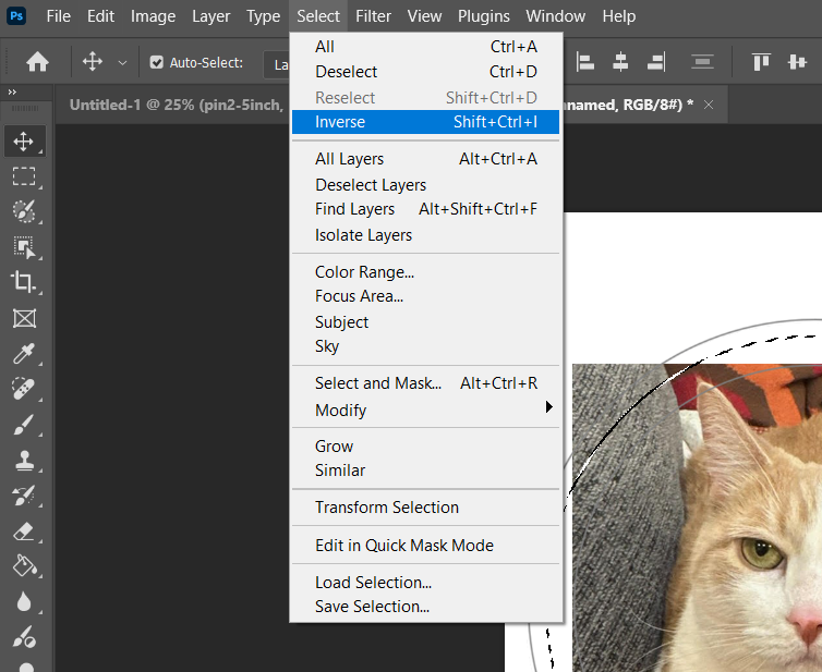
Object Selection and Select Subject aren't only standalone tools — the same AI-assisted actions also live as one-click buttons directly in the Properties panel whenever a pixel layer is selected, under Quick Actions:

Free Transform (Ctrl/Cmd+T) scales, rotates, and skews the current selection — Enter/checkmark commits, Esc cancels.
Color Range: selecting by color instead of by edgeEvery selection tool covered so far works by shape or edge. Select > Color Range works differently: click a color anywhere in the image, and it selects every pixel close to that color across the whole document, wherever it appears. The Fuzziness slider controls how close a color has to be to count — low Fuzziness selects only near-exact matches; high Fuzziness casts a wider net. It's the right tool for jobs like selecting a uniform blue sky, then replacing it, or isolating every red element in a logo at once.
Once any selection exists, three commands under the Select menu adjust it without starting over: Select > Grow expands the selection outward to include adjacent similar-colored pixels; Select > Similar adds every matching color anywhere in the image, not just what's adjacent; and inside Select and Mask, the Shift Edge slider nudges a refined edge slightly in or out — useful for trimming a stray sliver of background a selection tool left behind.
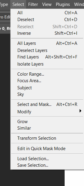
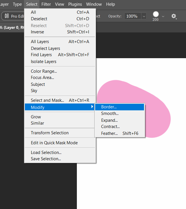
One more set of commands lives one level deeper, under Select > Modify: Border converts a selection into just a ring around its own edge, a fixed width in from both sides — useful for a stroke effect. Smooth rounds off jagged corners a fast, rough selection tends to leave behind. Expand and Contract grow or shrink a selection uniformly in every direction by an exact pixel amount — more predictable than Grow, which only adds similar-colored pixels rather than a fixed distance. Feather (also Shift+F6, directly, no submenu needed) softens a selection's edge into a gradient instead of a hard line, so whatever gets pasted or deleted through it blends instead of looking cut out with scissors.
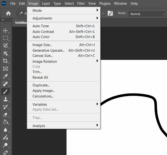
These two live one menu item apart under Image (Image Size is Ctrl/Cmd+Alt+I; Canvas Size is Ctrl/Cmd+Alt+C — close enough on the keyboard that it's worth double-checking which one you actually pressed) and do opposite things, which is exactly why they get mixed up. Image Size scales the actual pixels — make it bigger and existing detail gets stretched (or resampled) to fill the new dimensions; make it smaller and detail is genuinely thrown away. Canvas Size never touches a single existing pixel — it only adds or removes empty space around the content, using a 9-point anchor grid to control which direction the new space gets added from. Add canvas to the right of a photo to leave room for a text overlay; that's Canvas Size. Need the whole file to be a specific pixel dimension for a client spec; that's Image Size.
The Crop tool does something that looks similar to Canvas Size but works interactively, live on the canvas: drag its handles to define a new visible boundary, optionally lock a specific aspect ratio first (from its options bar), and press Enter to commit — anything outside the crop boundary is discarded (unless Delete Cropped Pixels is unchecked in the options bar, which hides the extra data instead of deleting it, recoverable later). A straightening option in the same tool lets you draw a line along anything that should be level — a horizon, a wall edge — and Photoshop rotates and re-crops the image to make that line perfectly straight.
Select an unwanted object — a stray person in the background, a power line — and choose Edit > Content-Aware Fill to open a dedicated workspace. A green overlay shows exactly which surrounding pixels Photoshop plans to sample texture from to rebuild the area underneath your selection; you can paint that sampling area larger or smaller before generating a result, and preview it live in a side-by-side panel before committing. It's the modern, far more reliable replacement for the older approach of manually cloning out an object patch by patch.
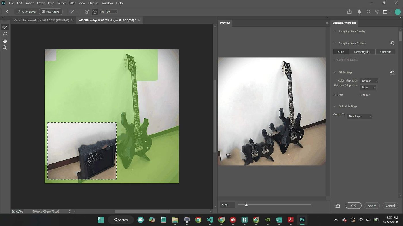 A closer look: the Clone Stamp and Gradient tools
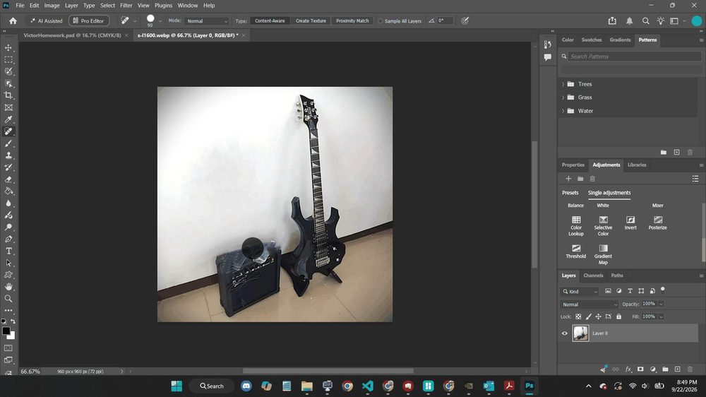
Two tools from the table above are worth a closer look, because each has its own options bar that changes how it behaves. The Clone Stamp copies pixels from one spot to another — Alt-click (Option-click on Mac) to set the source point, then paint elsewhere. Aligned keeps that source point moving with your brush across strokes; unchecked, every new stroke resamples from the original point again. The Gradient tool comes in five distinct types, selectable right on its options bar — Linear, Radial, Angle, Reflected, and Diamond — and which one you pick changes the whole feel of a fill.
The Clone Stamp's fly-out menu holds one more tool worth knowing: the Spot Healing Brush. Where the Clone Stamp copies pixels exactly, the Healing Brush family blends them — it matches the texture, lighting, and shading of the area around your brush stroke automatically, which is why a healed scratch or blemish tends to disappear more convincingly than a cloned one. Its Type setting controls how: Content-Aware reconstructs from the whole surrounding image (the same engine behind Content-Aware Fill); Create Texture builds a new texture from the pixels directly under the stroke, useful on a noisy or heavily textured area; Proximity Match samples only the pixels immediately bordering the stroke.
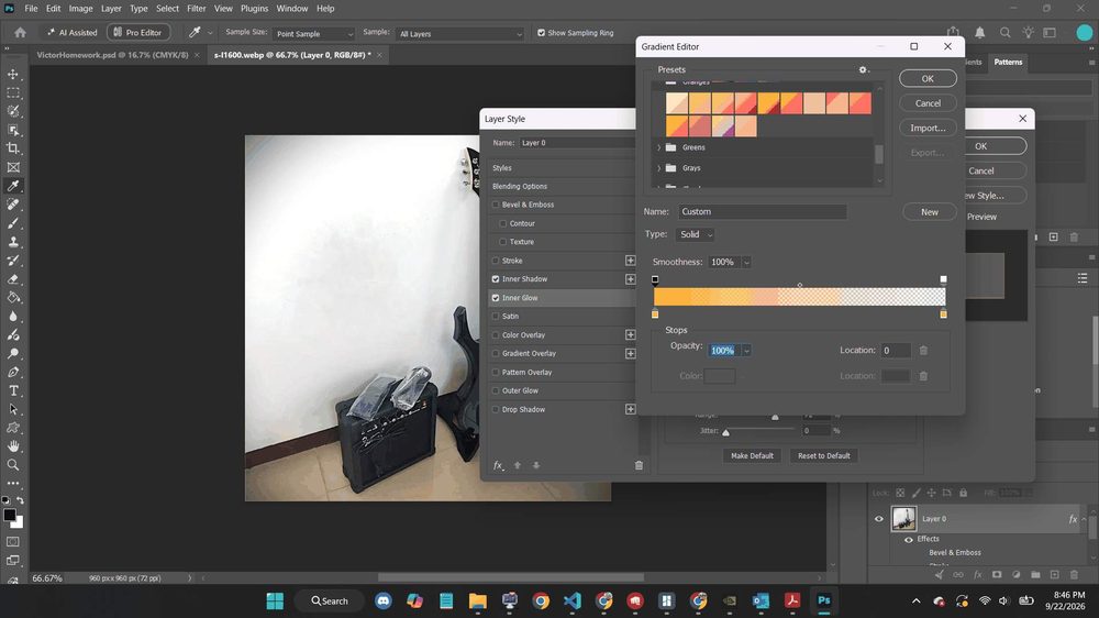
Click the gradient swatch itself, rather than just picking a type, and the Gradient Editor opens — this is where a gradient's actual colors get built, not just its shape. Presets are grouped by color family (Oranges, Greens, Grays, and more) along the top; below that, Stops are the individual color markers along the gradient bar itself — click anywhere under the bar to add one, drag an existing one to move it, and double-click a stop to change its color. Each stop also has its own Opacity, independent of its color, which is how a gradient fades to transparent instead of just fading to a flat color.
Step 1 — Rough selection. Open a photo with a clear subject. Use Quick Selection or Object Selection to select it. Don't aim for perfect yet.
Step 2 — Refine, don't redraw. Use Select > Modify > Smooth to round off any jagged spots, then a small Contract (1–2px) to pull the edge in slightly off any stray background pixels.
Step 3 — Invert and check. Run Select > Inverse. If the background — not the subject — is now selected, copy it to a new layer and hide it, then compare the cutout against the original.
Step 4 — One feathered copy, one hard-edged copy. Duplicate the cutout. Apply Select > Modify > Feather (try 8–10px) to the selection on one copy before finalizing it, and leave the other hard-edged. Place both on a new background and write one sentence on which one blends more convincingly, and why.
Find a subject on a plain background and a new background image. Select the subject with Quick Selection (or Object Selection), copy, paste into the background, and use Free Transform to scale/position it convincingly. Add a text layer naming which tool you used and why.
Take any photo. First use Canvas Size to add empty space to one side (pick a direction from the anchor grid) and add a text layer in that new space. Undo, then instead use the Crop tool to trim the same photo down to a square. Write one sentence explaining why the first was Canvas Size and the second was cropping.
Find a photo with an object you'd want removed (a sign, a person in the background, trash on the ground). Select it loosely and run Content-Aware Fill. Adjust the green sampling area at least once before generating a result, and compare the difference.
Masks are one of the most powerful nondestructive tools in Photoshop — a way to hide part of a layer without ever deleting a pixel, so the hidden part is always recoverable.
| Layer Mask | A grayscale “map” on a layer — black hides, white reveals, gray partially reveals. |
| Select and Mask | A dedicated workspace for refining a tricky edge like hair or fur. |
| Filter | An effect applied to appearance — sharpen, blur, stylize, grain. |
| Filter Gallery | Previews and combines several filters at once before applying. |
Add a layer mask and paint black to hide, white to reveal — you're never erasing pixels, only painting a map of what currently shows, fully reversible any time. A soft brush at the mask edge produces a gradual, believable fade.
Click a layer mask's thumbnail in the Layers panel to select it, and the Properties panel switches to showing that mask's own controls — separate from anything on the layer itself. Density works like a master opacity for the whole mask at once (100% is fully committed to whatever's currently painted; dragging it down makes the entire mask semi-transparent, hidden areas included); Feather blurs the mask's edge by a set radius, after the fact, without repainting anything.
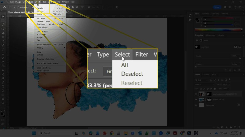
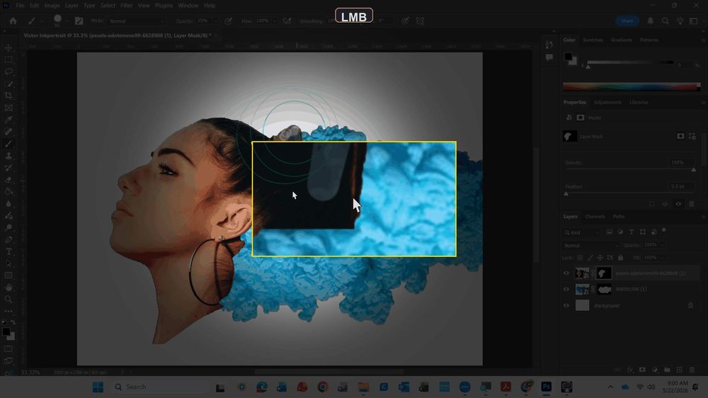
For a manual touch-up on one small area instead of the whole mask, click back onto the mask thumbnail and paint directly with a normal brush — black to hide more, white to reveal more, exactly as this section opened with. The Brush panel's own picker controls the tip: Hardness at 100% cuts a crisp edge; dragged down, it feathers that single brush stroke's own edge, useful for blending a touch-up seamlessly into a mask edge that Select and Mask already refined.
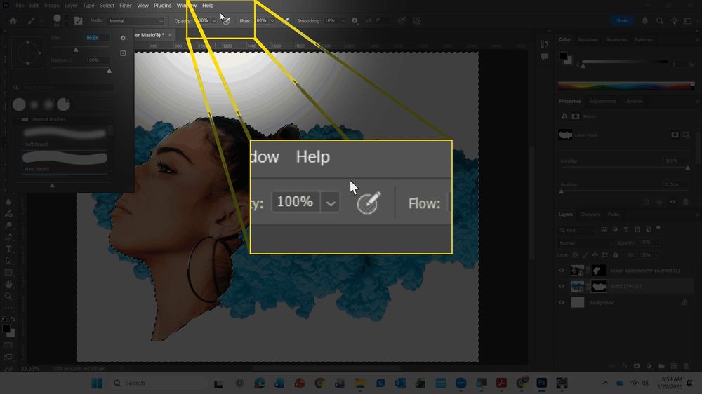
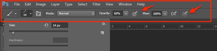
Low brush Opacity (Fig. 3.5k) is what makes a touch-up like this forgiving instead of risky: at 25% Opacity, one stroke over an already-masked edge only nudges it partway, so an overcorrection is easy to soften with another pass in the opposite direction rather than needing Undo.
Hair is the textbook-hard case for a selection — hundreds of thin, semi-transparent strands, no clean single edge to trace. Select and Mask (Select menu, or Alt/Option+Ctrl/Cmd+R from any selection tool) exists specifically for cases like this: its Refine Edge Brush is painted directly along a fuzzy boundary like hair or fur, and it automatically detects fine detail inside that stroke instead of just following one hard line the way a normal selection tool would.
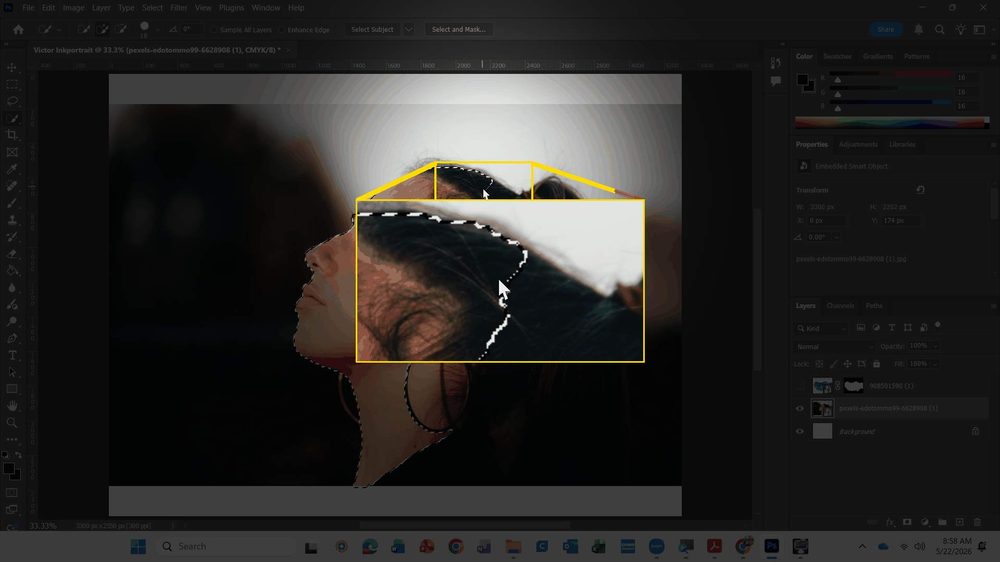
Once that selection is right, clicking OK with Output To set to Layer Mask converts it directly into a mask on the current layer — no separate step needed, and still fully repaintable afterward with a normal brush if one small spot needs a manual touch-up.
Step 1 — Source two images. A portrait with a clear silhouette against a plain background, and a smoke, ink, or paint-splash texture (free stock sites like Pexels or Unsplash both have plenty). File > Place Embedded brings each in as its own layer.
Step 2 — Position the texture where the hair should read. Scale and place the smoke/ink layer roughly where the portrait's hair falls, using Free Transform. It doesn't need to be precise yet — the mask in the next step decides the real boundary.
Step 3 — Select the hair with Select and Mask, output to a mask. On the portrait layer, use Select and Mask's Refine Edge Brush along the hairline (Fig. 3.5l shows this step for real), then set Output To: Layer Mask. The texture layer underneath now only shows through where the portrait's hair used to be.
Step 4 — Finish nondestructively. Add a Levels or Black & White adjustment layer above everything to unify the color and contrast between the photo and the texture, so the composite reads as one image instead of two pasted-together ones.
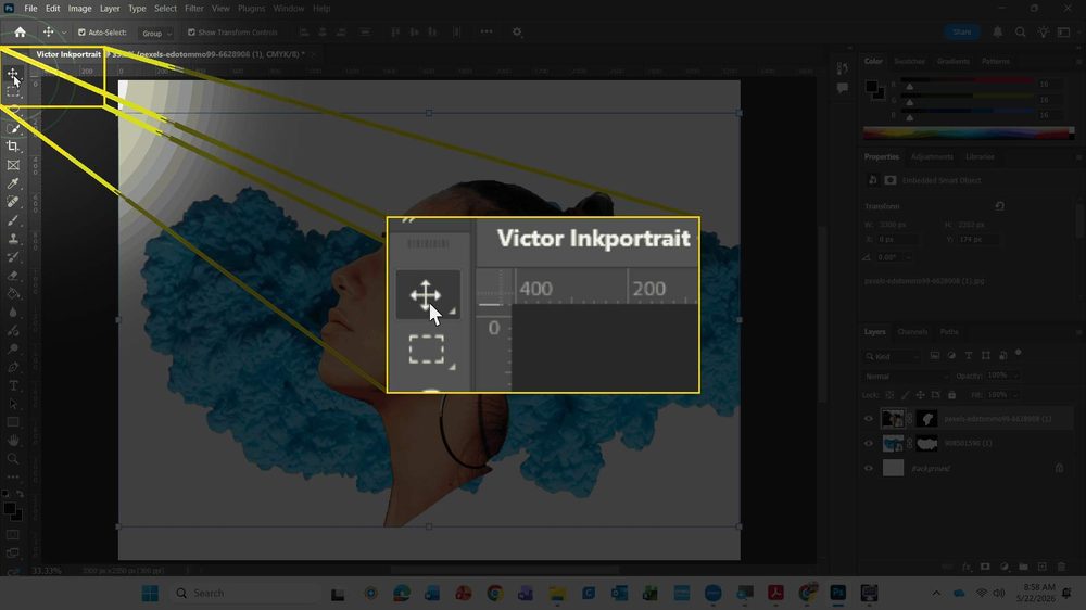
That's the mask doing its job — but Step 4 is what turns a technically-correct composite into a finished piece. A Color Balance adjustment layer, added last and affecting everything below it at once, is what actually unifies a photo and a texture that started out with completely different color casts.
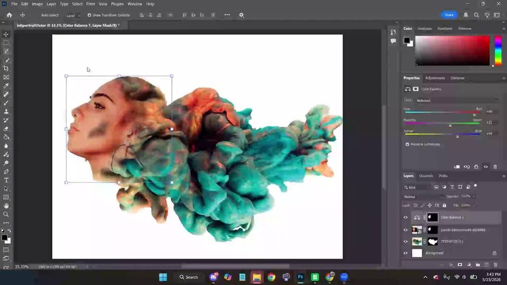

| Type | Best for |
|---|---|
| Layer Mask | Grayscale, paintable, freeform photographic edits. |
| Clipping Mask | Content appearing only inside the exact shape of another layer. |
| Vector Mask | A perfectly clean, scalable geometric edge. |
| Quick Mask Mode | Building a complex selection with brush strokes (press Q). |
For genuinely tricky edges — hair, fur, semi-transparent fabric — make your best rough selection, then open Select and Mask to refine specifically that edge using edge-detection, often recovering detail a normal selection tool would clump together.

Neural Filters (Filter > Neural Filters) — AI-powered filters like Skin Smoothing, Style Transfer, and Harmonization — are a newer addition and increasingly common in real workflows. Know they exist even if a tutorial you're following predates them.

An adjustment layer like Vibrance boosts muted colors more than already-saturated ones, usually more natural than a blanket Saturation boost. When combining overlapping photos into one seamless image, Edit > Auto-Blend Layers (Panoramic) finds the best seam automatically.
Double-click any layer (or use the fx icon at the bottom of the Layers panel) and you get the Layer Style dialog — a checklist of effects you can stack on that layer, each with its own settings. A styled layer shows a small “fx” badge in the Layers panel (Fig. 3.2), and — like an adjustment layer — a Layer Style is always live: reopen it any time and change the shadow's angle or the stroke's width, with nothing baked permanently into the pixels. To reuse a look, right-click a styled layer and Copy Layer Style, then paste it onto another.

What each of those ten effects actually does.4
| Effect | What it does |
|---|---|
| Bevel & Emboss | Adds a fake 3D edge — highlight on one side, shadow on the other — making flat content look raised or pressed in. |
| Stroke | Adds a solid, gradient, or pattern outline around the layer’s exact shape, at a chosen width. |
| Inner Shadow | Adds a shadow just inside the layer’s edge, as if the content were recessed into the surface below it. |
| Inner Glow | Adds a soft glow just inside the layer’s edge, the interior counterpart to Outer Glow. |
| Satin | Adds a soft, curved interior shading pattern — produces a smooth, satin-like sheen across the shape. |
| Color Overlay | Fills the entire layer with a flat color, on top of whatever’s already there — the fastest way to recolor a shape or icon. |
| Gradient Overlay | Fills the entire layer with a gradient instead of a flat color. |
| Pattern Overlay | Fills the entire layer with a repeating pattern. |
| Outer Glow | Adds a soft glow radiating outward from the layer’s edge — classic for making text or an icon pop off a busy background. |
| Drop Shadow | Adds a shadow cast behind and offset from the layer, as if it were lifted above the surface below it — the single most-used Layer Style. |

Every effect just covered can be built by hand, layer by layer — or applied instantly from a saved preset. Same underlying tool (Layer Style), completely different starting point. One click is the difference between plain text and this:
Both “LAYER”s started as identical plain white type. One click applied each texture — no manual Bevel & Emboss, no manually-picked gradient.
Open it from Window > Styles:

The panel that opens is organized into folders — Basics, Natural, and more depending on your Photoshop version — each one a click away from expanding into its own row of thumbnails:

Like every other panel, it has its own hidden settings behind the ☰ menu icon — including a thumbnail size that trades detail for how many presets fit on screen at once, exactly the same trade-off as the Layers panel's own thumbnail setting from earlier in this chapter:
Chapter 3.1's drag-the-fx-badge trick isn't the only shortcut. Right-click a styled layer and two more commands appear: Copy Layer Style copies everything currently applied; right-click a different layer and choose Paste Layer Style to apply that exact same combination there. Useful the moment a style needs to travel between layers that aren't next to each other, where dragging a badge isn't practical.

Once applied, a style's individual effects show up as their own sub-rows in the Layers panel, nested under that layer — click the small arrow next to the fx badge to expand or collapse them:

Expanded, each individual effect gets its own eye icon — toggle one effect off without touching the others, or opening the dialog at all:

Find two images that could plausibly combine. Add a layer mask and paint black/white to blend one into the other with a soft edge. Try one Filter Gallery effect and one adjustment layer on the result. Write which mask type you used and why.
Fill out each box with the correct definition of each term. Remember, these terms come back on quizzes and the exam.
Looking at Fig. 3.5c: which part of that flyer was almost certainly built with a mask, and how can you tell?
When would you reach for a Clipping Mask instead of a Layer Mask?
Describe, step by step, exactly how you would mask a photo of a person into a circular frame like Fig. 3.5c — name every tool and panel you'd touch, in order.
Everything in this chapter, in one real deliverable. A business card is small enough to finish in a few sessions, but it forces every skill covered so far to actually work together: purpose and audience from Chapter 1 (who is this card for, what should someone do after reading it), type, color, and unity from Chapter 2, and the workspace, rulers, and guides from this chapter — specifically, the print-industry standard technique of laying out several cards on one sheet so a single 8.5×11in print does the work of eight.
Before opening Photoshop, know what the finished card actually needs to contain. A good business card is simple, easy to read, and includes exactly the right amount of information — not more:
| Element | Why it belongs on the card |
|---|---|
| A clear, printed name | The single most important piece of information — legible at a glance, in a font size and weight that doesn't compete with anything else on the card. |
| What you do | The services you provide, or your role — answers the question “why would I keep this card?” |
| How to reach you | Contact info: email, phone, or a portfolio link — the entire point of a business card is that someone can act on it later. |
| A logo (optional) | Not required, but recommended — something to identify you by, or purely for aesthetic unity with the rest of your work. |
| Consideration | What to actually do |
|---|---|
| Typography | Chosen type should be professional and clear to read. With dozens of fonts available, pick one that fits the theme — not just one you like. |
| Color | Choose colors that represent you and complement each other, working with the card's overall theme — not fighting it. Color carries feeling: cool blues read differently than warm oranges before anyone reads a single word. |
| Unity | Artwork, typography, color, and every other design choice should feel like one coherent piece — a business card is also a small sample of how you design, period. |
This is the actual point of the project: instead of designing one card on its own canvas, you'll set up a full 8.5×11in sheet with guides marking out eight card-sized cells — the same way a real print shop expects multiple-up artwork. Follow these steps exactly; the specific numbers matter.
Create a new document at 8.5 × 11in, 300 PPI, RGB. Title it Business Card_YourName — a real, findable filename, the way a client or teacher would expect to receive it.
Turn on rulers (View > Rulers, or Ctrl/Cmd+R). Right-click directly on a ruler and switch the unit to Inches — the default is usually pixels, and every measurement from here on is in inches.
Drag one guide from the left ruler to the exact center of the sheet: 4.250in. Remember: the only way to place a guide is to click directly on a ruler and drag onto the canvas — there's no menu shortcut for a single freehand guide.

Drag two horizontal guides from the top ruler: 0.500in and 10.500in — a half-inch margin at both the top and bottom of the sheet.
Drag two more vertical guides: 0.750in and 7.750in — the left and right margins. Combined with the center guide from Step 3, the sheet is now split into two even columns, each exactly 3.5in wide.
Drag four evenly spaced horizontal guides down from the top margin: 2.500in, 4.500in, 6.500in, and 8.500in — each exactly 2in apart. Combined with Step 4's guides, the sheet is now split into four even rows, each exactly 2in tall.

That's not an arbitrary number — it's the standard U.S. business card size, the size every commercial printer, cutter, and card-holder is built around. Setting up guides to this exact spec isn't busywork; it's the actual habit of a designer preparing real print-ready artwork, not just a pretty image on screen.
With the grid in place, save the document — the setup work is done. From here:
Before you submit, check your own work against the brief.
Does your card include all three required elements (name, what you do, how to reach you)? List where each one appears.
Name the one typeface you chose and one specific reason it fits your card's theme.
What feeling were you going for with your color choices, and which colors did you use to get there?
Why does a real print shop want eight identical cards on one sheet instead of one card printed eight separate times?
▸ Further learning: the Photoshop Training Channel has dedicated video walkthroughs on masks and compositing.
▸ Looking ahead: Chapter 4 covers document setup, the Pen tool, and exporting a finished file correctly.
Chapter Four
04
Starting from a blank canvas, retouching nondestructively, drawing precise vectors with the Pen tool, and getting a finished file out in the right format — Domains 4 through 6 of the exam, and the difference between a draft and a deliverable.
Chapter 3 taught you the tools to edit an existing photo. This chapter is about building something from nothing — and finishing the job correctly.
Chapter 3 covered creating a blank document from scratch. A huge amount of real design work instead starts by bringing outside material in — a client’s logo, a stock photo, assets from another designer — which is what this section covers.
| Document | A Photoshop file — the working canvas everything gets built on. |
| Place | File > Place Embedded/Linked — imports an external image as a new layer. |
| Document Preset | A saved set of document settings you can reuse instantly. |
By now — Chapter 3 opened with it — creating a new document is second nature. This section is about the other half of starting a project: bringing existing material into one. File > Place Embedded copies an outside image’s data directly into your file as a new layer (self-contained, travels safely with the document); Place Linked keeps that layer pointing back to the external file instead (a smaller document, but the linked file has to travel with it, or the link breaks).
Start a blank document. Place two or three images and arrange, scale, and mask them into one intentional composition using Chapter 3's skills. Add a text layer explaining what you made.
Open File > New three separate times: once from the Print tab, once from the Web tab, and once from the Film & Video tab. For each, write down the default Width, Height, Resolution, and Color Mode it starts you with, and explain in one sentence why that category defaults to those numbers.
Fill out each box with the correct definition of each term. Remember, these terms come back on quizzes and the exam.
You need a document that will be printed at a commercial print shop. Which Color Mode and Resolution should you choose, and why?
You already have a finished 1080px-wide document but the client now wants extra blank space above the image for a logo. Do you use Canvas Size or Image Size? Why?
| Color Correction | Adjusting color balance, brightness, or contrast to fix a flaw or achieve a look. |
| Smart Object | A layer preserving its original source content, editable nondestructively. |
| Smart Filter | A filter applied to a Smart Object — fully editable/removable later. |
Convert a layer to a Smart Object before applying a filter or scaling it dramatically, and that filter becomes a Smart Filter — removable any time, original pixel data untouched. Scale a normal layer 300% and quality permanently degrades; scale a Smart Object and you can always scale back down.
Embedded vs. Linked Smart Objects: embedded carries full source data inside the document; linked references an external file — smaller document, but keep the source with it (or use Package for delivery).
A typical retouching pass combines several small, reversible steps: a Curves/Levels adjustment for color correction, the Clone Stamp or healing tools for cleanup, and a subtle Filter Gallery effect for mood — each individually undoable.
Chapter 3 introduced the Adjustments panel as a row of one-click icons. What it doesn't show is that every one of those icons opens onto a different kind of control, and picking the right one for the job matters more than knowing every slider inside it. Levels and Curves both fix brightness and contrast, but Levels does it with three sliders (black point, white point, midtone gamma) while Curves does it by reshaping an entire tone curve by hand — more power, steeper learning curve, literally. Hue/Saturation shifts color family and intensity without touching brightness; Color Balance pushes shadows, midtones, and highlights toward or away from a color independently, which is the one most color-grading work actually starts from. Black & White isn't the same as desaturating — it lets each original color convert to its own separate gray value, so a photo can be re-balanced in grayscale after the color is gone.
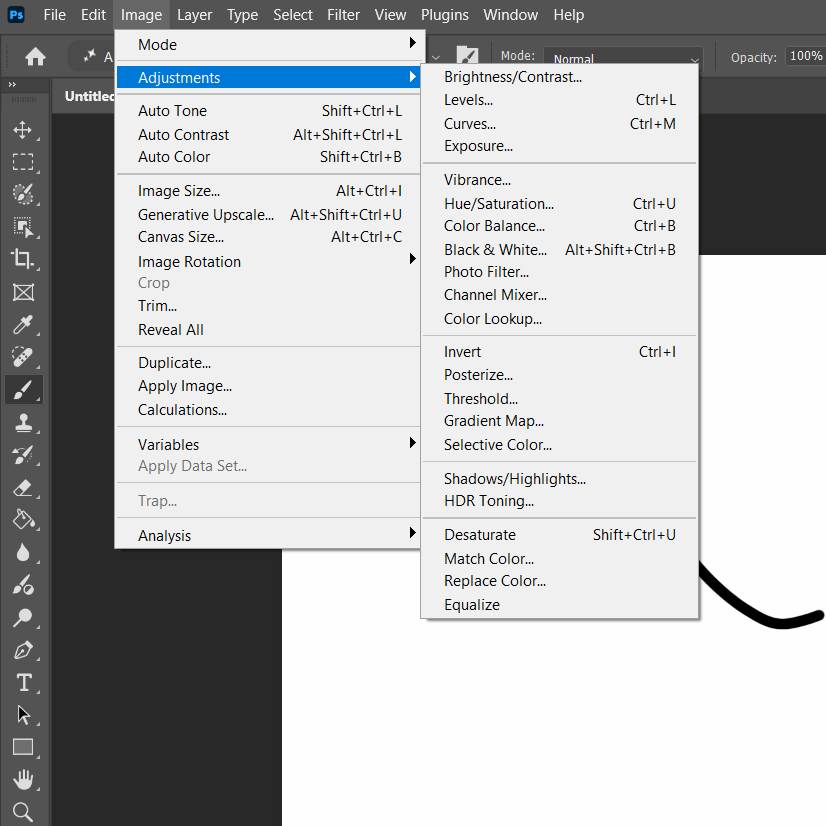
That divide — direct edit vs. adjustment layer — is the single most important habit in this whole section. Choosing Image > Adjustments > Curves bakes the change permanently into that layer's pixels the moment you click OK. Choosing the same Curves icon from the Adjustments panel instead creates a new layer above it — the original pixels underneath are never touched, the adjustment can be double-clicked and re-edited at any point later, hidden with one eye-icon click, deleted with no trace, or clipped to affect only the layer directly below it instead of everything. There is essentially never a reason to use the direct version once the panel version exists.
The Filter menu ranges from single-click effects to entire dedicated workspaces. Filter Gallery stacks multiple artistic filters (sketch, texture, distort) with live preview and reorderable layers, similar in spirit to the Layers panel itself. Camera Raw Filter brings the same powerful, non-destructive-by-default editing interface RAW photographers use to any layer, JPEG included. Liquify pushes, pulls, and warps pixels directly under a brush — the standard tool for reshaping a feature in a portrait or fixing a bent line in product photography. Neural Filters and the newer AI Denoise / AI Sharpen run Adobe's machine-learning models directly inside the filter workflow — skin smoothing, colorizing an old black-and-white photo, or recovering detail lost to noise or motion blur, without manual retouching.
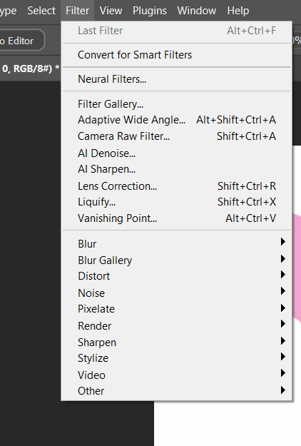
Run any of these on a normal layer and the effect is permanent the instant it's applied — the only way back is Undo, and only until you do something else. Run Filter > Convert for Smart Filters first (or apply it to a layer that's already a Smart Object) and every filter afterward stacks in the Layers panel underneath that layer, each one independently editable, reorderable, or deletable, with its own opacity and blend mode — exactly like a Layer Style's effects list, and for the same underlying reason: nothing about the source pixels is ever touched.
A retouching pass usually ends with one decision that has nothing to do with how the image looks on screen: what color mode it needs to leave in. Everything in this book so far has assumed RGB — the mode a screen actually displays light in, and the correct mode for anything staying digital. A commercial printer instead needs CMYK — four inks instead of three lights — and converting late, right before handoff, matters: RGB has a wider range of colors than CMYK can reproduce in ink, so a bright RGB blue or green can visibly shift once converted. Converting early and continuing to edit in CMYK just means editing inside that narrower range the whole time for no benefit.
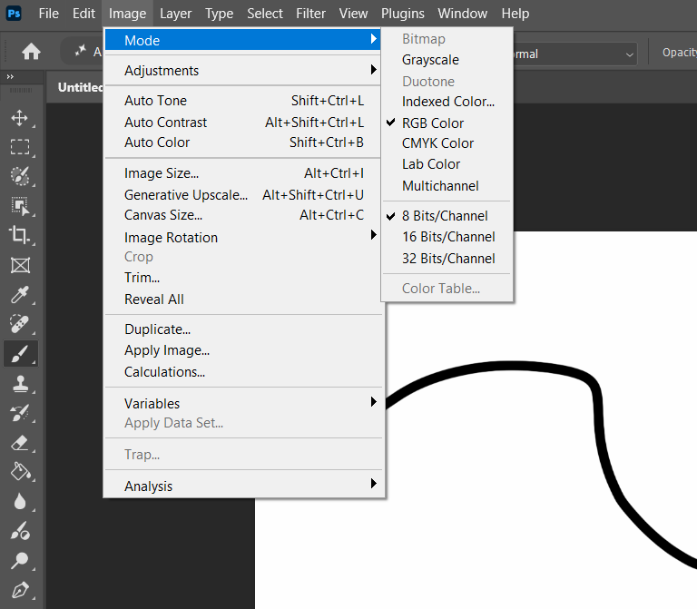
Step 1 — Duplicate before touching anything. Open a portrait photo. Duplicate the Background layer (never edit it directly — it's your undo insurance beyond Photoshop's own History).
Step 2 — Two adjustment layers, in order. Add a Curves adjustment layer and correct overall brightness/contrast. Add a Color Balance adjustment layer above it and correct any color cast. Note which order you did them in, and whether swapping the order would change the result.
Step 3 — One filter, as a Smart Filter. Convert the duplicated photo layer to a Smart Object, then apply Camera Raw Filter or a subtle Filter Gallery effect to it. Confirm it now shows nested under that layer in the Layers panel, independently editable.
Step 4 — Prove it's reversible. Hide each adjustment layer one at a time (eye icon) and describe, in one sentence each, exactly what that layer was doing. Then double-click the Smart Filter's name to reopen and change one setting.
Improve any photo using at least one color-correction adjustment layer and one filter applied as a Smart Filter. Write a process note explaining exactly what you changed and why.
Take the same adjustment layer (Curves or Hue/Saturation) and apply it two ways on two duplicate copies of a photo: once directly via Image > Adjustments, once as an adjustment layer from the panel. Try changing your mind on both after the fact. Write one sentence on what happened differently.
Open any RGB photo and check Image > Mode. Convert a duplicate to CMYK and compare the two side by side — zoom into the most saturated color in the image specifically, where a shift is easiest to see.
The Pen tool creates precise vector paths — built out of points and curves rather than pixels, genuinely useful and intimidating on first contact.
| Anchor Point | A point placed with the Pen tool, marking the end of a path segment. |
| Path | The line (straight or curved) connecting anchor points. |
| Direction Handle | The adjustable lever from a click-and-drag anchor, shaping the curve. The lines are direction lines; the endpoints are direction points. |
| Curvature Pen Tool | A simpler variant creating smooth curves automatically, no manual handles. |
Some older, non-official study material invents a made-up term — “breezer” — for what a click-and-drag Pen tool anchor produces. That is not real Photoshop or industry terminology and won't appear in Adobe's own documentation, in GMetrix, or on the real exam. The correct term, used everywhere professionally, is a direction handle. If you've seen “breezer” anywhere, mentally replace it every time.
Click once, then click again elsewhere: a straight-line segment. Hold Shift to constrain to horizontal/vertical/45°. To create a curve, click and drag at an anchor point — this pulls out a pair of direction handles whose length and angle shape the curve. It takes real practice to get this right — that's normal.
The Curvature Pen tool smooths the path between clicks automatically, without dragging any handles — a friendlier place to start.
A path alone has no fill or stroke. Select it and use Make: Shape to turn it into a real, filled shape layer, editable in the Properties panel.
Here's what one of those direction handles actually looks like on a real anchor point, up close:

Zoomed back out, here's a finished piece built entirely from paths made exactly that way:
 Shape tools: faster than the Pen, editable in a different place
For geometric shapes, the dedicated Shape tools — Rectangle, Ellipse, Polygon, Line, and Custom Shape — are faster than the Pen tool and produce the exact same kind of thing: a real, scalable vector shape layer. Their options bar sets Fill and Stroke color before you draw, plus a stroke width and (for the Polygon tool) a number-of-sides field. Four Path Operations buttons on that same options bar — Combine Shapes, Subtract Front Shape, Intersect Shape Areas, and Exclude Overlapping Shapes — control how a new shape interacts with one already on the same shape layer, which is how a single layer can hold a complex icon built from several simple pieces added or subtracted from each other.

The Custom Shape tool comes loaded with entire libraries of premade vector shapes — far beyond basic geometry — accessible from a dropdown on its options bar:

Editing a shape after it's drawn is exactly the part that isn't intuitive: it doesn't happen in the same place a photo edit would. A rounded rectangle's corners, for instance, are adjustable live — but only from the Properties panel while that shape layer is selected, where a corner-radius field (sometimes four separate corner fields, unlinked with a small chain icon) reshapes them non-destructively at any time, long after the shape was drawn. Moving or reshaping the path itself uses two different tools that are easy to confuse: the Path Selection tool (solid black arrow) selects and moves an entire shape or path as one object; the Direct Selection tool (hollow white arrow, right underneath it in the toolbar) selects and drags individual anchor points and direction handles inside a shape, reshaping it point by point — the same way you'd edit a Pen tool path.
Using the Curvature Pen tool, trace a simple closed shape and convert it to a filled shape. Then try the same shape with the regular Pen tool's manual direction handles and compare the difficulty. Build a 3–5 icon set sharing one consistent style.
Draw a rounded rectangle, then reshape only its corner radius from the Properties panel — not by redrawing it. Draw a second shape overlapping the first and combine them into one icon using each of the four Path Operations in turn, screenshotting the result each time. Finally, use the Direct Selection tool to drag one single anchor point on a shape and describe what moved versus what stayed put.
Fill out each box with the correct definition of each term. Remember, these terms come back on quizzes and the exam.
Number these four steps in the order you'd actually perform them: (a) Convert the path to a filled shape (b) Click to place an anchor point (c) Drag to pull out a direction handle and curve the segment (d) Close the path by clicking the first anchor again.
Looking at Fig. 4.5c, pick one shape in that flyer that looks hand-drawn with the Pen tool. Sketch, on paper, roughly where you'd place each anchor point to recreate it.
| Save / Save As | Writes a .PSD — the editable working file, layers and all. |
| Quick Export | The fastest one-click export to a common format (PNG by default). |
| Export As | More control than Quick Export — format, quality, and size per export. |
| Save for Web (Legacy) | The most granular file-size-vs-quality control, still available. |
Save and Export answer two different questions, and mixing them up is a common early mistake. Save (Ctrl/Cmd+S) and Save As (Shift+Ctrl/Cmd+S) write a .PSD — the working file, every layer, mask, and adjustment layer still fully editable. That's the file to keep for yourself and reopen later. Export flattens the project down into a single delivery format — a JPEG, a PNG — for a client, a printer, or a website, none of whom need (or can open) your layers. A finished project should almost always end up as both: one saved .PSD kept for future edits, one exported file actually handed off.
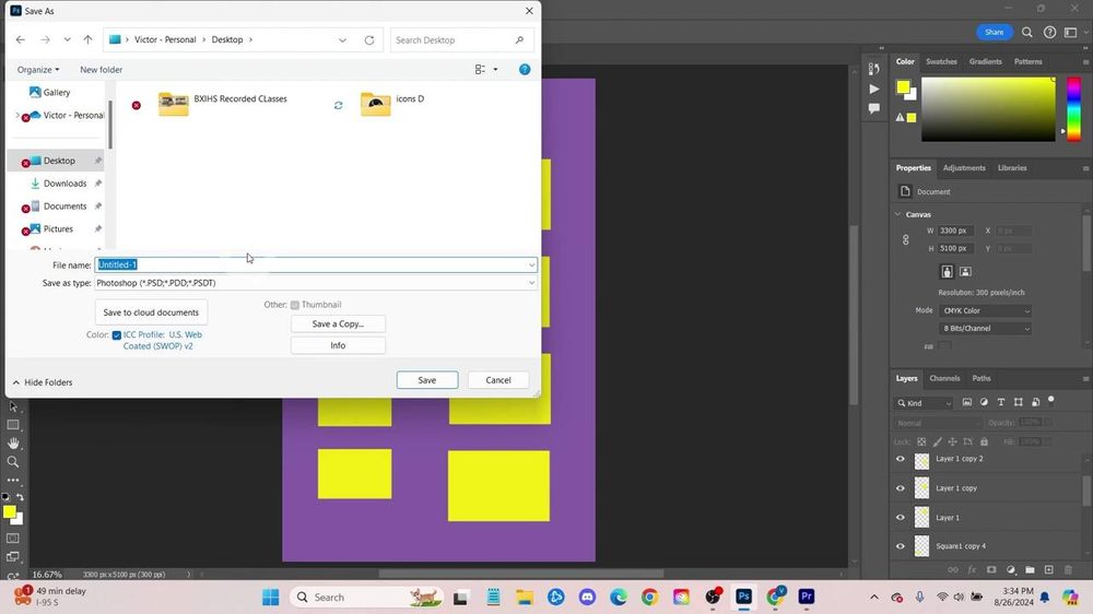
All exporting lives under File > Export. Quick Export as PNG is fastest for a standard file with no special settings. Export As gives a proper dialog matching Chapter 2's format table. Save for Web goes further for situations where every kilobyte matters. For print, use File > Print (Ctrl/Cmd+P) directly.
Whatever method you use: export based on what the destination actually needs, checked before exporting, not after.

Exporting isn't always the last step — sometimes the file still has to survive being turned into a physical object. This class has run exactly that project: designing a custom button pin in Photoshop from a provided template, then actually punching and pressing it into a real pin with a button-maker machine. It's a genuinely useful stress test for everything this chapter covers, because a print file that's slightly wrong doesn't just look bad — the machine physically can't cut it correctly.
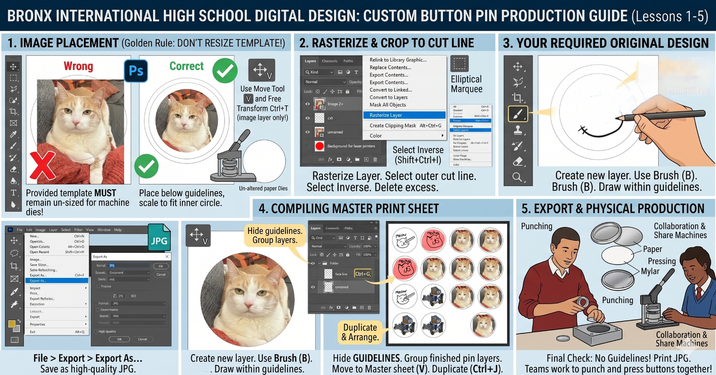
Step 2 — rasterizing and trimming to the cut line — is where a technique from earlier in this book pays off in a very concrete way. The provided template has its circular cut line on its own layer. Ctrl/Cmd-clicking that layer's thumbnail in the Layers panel loads its exact shape as a selection, instantly, no selection tool needed at all — then Select > Inverse flips it to select everything outside the circle, ready to delete. It's the same Select > Inverse from Chapter 3, applied to a real print deadline instead of a practice file.
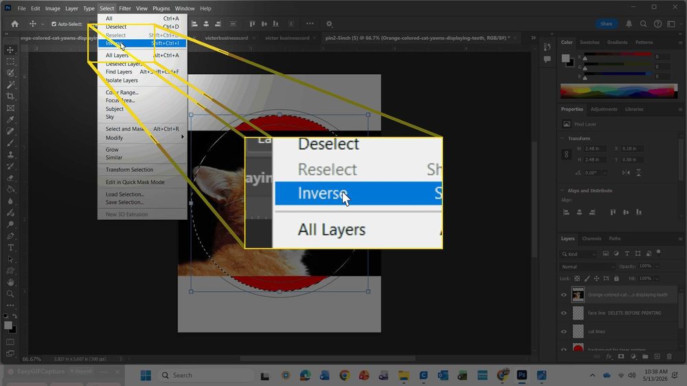
Notice what the “Golden Rule” in step 1 is really protecting: the provided template's own dimensions have to stay exactly what the physical die-cutting machine expects. Scaling the artwork to fit inside the template is correct; scaling the template itself breaks the file for the machine even if it still looks fine on screen — a real-world version of the Canvas Size vs. Image Size distinction from Chapter 3, where changing the wrong thing can look identical on screen and still be wrong.
Build a small circular design of your own (even a simple one). Put the outer boundary on its own layer, Ctrl/Cmd-click that layer's thumbnail to load it as a selection, then use Select > Inverse and delete to trim everything outside it cleanly — without ever picking up a selection tool.
Export one finished project three ways — Quick Export PNG, Export As JPEG, Save for Web. Compare file sizes and note which you'd actually use for a real client handoff.
▸ Further learning: the Photoshop Training Channel has dedicated Pen tool tutorials worth watching more than once.
▸ Looking ahead: Chapter 5 is short and different — not new skills, but exactly what the real current exam looks like and how to set up your accounts.
Chapter Five
05
Short on purpose: replacing guesswork and outdated descriptions with an accurate picture of the current certification exam, and getting your accounts set up before you start practicing.
Some older study material describes an exam that no longer exists — a 40-question, 50-minute, entirely multiple-choice test citing a 2017 guide. That's out of date. Here's what it actually is.
The certification is officially called “Adobe Certified Professional in Visual Design Using Adobe Photoshop,” delivered by Certiport, currently exam version 2025 (v26.x). There is no separate “2026 exam” — 2025 (v26.x) is current as of this writing, and both Certiport and GMetrix only offer this version.
The exam runs about 50 minutes, in two parts:
GMetrix is a separate, commonly-used practice platform. Its question-and-answer style feels a little different from the live, inside-Photoshop Compass format — practice both: vocabulary cold, and fast/accurate actual tool use.
| # | Domain | This book |
|---|---|---|
| 1 | Working in the Design Industry | Ch. 1–2 |
| 2 | Project Setup and Interface | Ch. 3–4 |
| 3 | Layers, Masks, and Adjustments | Ch. 3 |
| 4 | Adding Content to a Document | Ch. 3–4 |
| 5 | Modifying Visual Elements | Ch. 3–4 |
| 6 | Publishing Digital Media | Ch. 4 |
For the exact, official, sub-objective-level wording, the current objectives document is publicly available directly from Certiport — always check there for the most current version rather than relying on any single book to stay perfectly up to date forever.
Close the book. From memory, write all six domain names in order — then check yourself against the table above.
What is a LITA task, and how is it different from a normal multiple-choice question?
Name one thing you should do before starting a task that has an Exhibit tab.
You need two separate accounts before you can practice or test — set both up early, not the week of the exam.
Add your GMetrix key — connects your account to your class. Your teacher will give you this key; it's specific to your class and shouldn't be shared outside it.▸ That's the core of the book. Everything through here is what the current certification actually expects you to know and be able to do.
Back Matter
Every fact, tool description, and exam detail in this book was checked against a real, named source. This section collects all of them in one place, organized by how they were used.
| “The Digital Way,” 2nd edition1 | The original 197-page Digital Media Design classroom book this edition rewrites and modernizes. Its chapter structure, teaching sequence, worksheet format, and core teaching examples — the audience/purpose photos, the design-principle diagrams, the workspace and masking screenshots, and more — come directly from it; every domain has been checked and updated against the current exam and current Photoshop. |
| “The Digital Way” lesson slide decks1 | The original per-lesson lecture slides (one deck per lesson, Modules 1–5) this teacher built to accompany the book in class — used alongside the book itself to check details and pull additional real screenshots. |
| Photoshop Tool Reference deck1 | A supplementary reference deck this teacher built cataloguing all 69 real Photoshop toolbar icons alongside their functions and shortcuts — the source for every icon and description in Chapter 3's complete toolbar reference table. |
| “Business Cards: Rulers and Guides” lesson7 | This teacher's original 26-slide business-card lesson — the source for Chapter 3's capstone project, including its exact guide measurements and both real screenshots. |
| Adobe Certified Professional Exam Objectives2 | “Adobe Certified Professional in Visual Design Using Adobe Photoshop,” exam version 2025 (v26.x), published by Certiport, a business of NCS Pearson, Inc. The authoritative source for Chapter 5's exam format, the 6 real domains, and the current key terms referenced throughout (AI-generated content, restricted fonts, model/location releases, bit depth, gamut, histogram, and more). |
| Photoshop Training Channel3 | A free, independent video tutorial library linked at the end of every chapter for hands-on demonstrations this book's text can't fully replace — especially for the Pen tool and masking. Its written tools-and-toolbar reference guide, by Steve Patterson, was also used directly to check tool names, keyboard shortcuts, and behavior throughout Chapter 3. |
| Adobe Photoshop Help4 | Adobe's own official documentation site — the authoritative reference for verifying interface facts, tool names, and terminology throughout this expanded edition. |
| pathedits.com5 | A free, independent beginner's guide to Photoshop's tools, referenced for real-world technique tips (bracket-key brush sizing, the Dodge/Burn Range setting) added to Chapter 3. |
| bwillcreative.com6 | A free, independent tool-by-tool explainer, linked as further reading for anyone who wants a second explanation of any tool covered in this book. |
| Adobe Education Exchange | Publicly shared classroom curriculum (the “Advertisements” project unit) that informed this edition's client-work material: design comps, team roles, and the project production-phase framework in Chapter 1. |
| U.S. Copyright Office & contemporary news coverage | Shepard Fairey v. Associated Press (2009–2011), the “Hope” poster case discussed in Chapter 1 — a real, widely reported copyright case, summarized here rather than quoted from any single article. |
| Adobe Color | color.adobe.com, referenced as a free tool for the Chapter 2 color-harmony exercise. |
Three kinds of figure appear in this book. Most — the workspace layout, the Layer Style dialog, the color wheel, the comparison diagrams — are original artwork, drawn specifically for this edition to teach a concept clearly. A second group are real Photoshop screenshots and finished example pieces (marked with footnote1 in their caption), and a third group are the free stock photographs “The Digital Way” itself originally licensed to illustrate a concept (the “purpose of an image” photos in Chapter 1, for instance). All of these — screenshots, finished pieces, and stock photos alike — are used here as the direct continuation of that same original material, not sourced from any other outside party, and no image showing an identifiable person's face was carried forward from the original book into this edition.
▸ See the Preface at the front of this book for this edition's full license and terms of free use.


