
Digital Media Design · Bronx International High School
The Layout Path
An InDesign & Publication Design Study Book
7 chapters · 6 exam domains · every term testable on the real exam
Digital Media Design · Bronx International High School
An InDesign & Publication Design Study Book
“The Layout Path” is Book Four in this Digital Media Design series, written by a teacher at Bronx International High School for his own students and provided to them entirely free of charge. Where “The Digital Path” (Book Three) covers Photoshop, this book covers Adobe InDesign — the industry-standard tool for laying out anything with more than one element working together on a page: brochures, newsletters, business cards, yearbooks, magazines, books. It's aligned chapter-for-chapter to the real, current Adobe Certified Professional exam for InDesign, the same way the Photoshop book is aligned to its own exam.
You are free to copy, share, print, and adapt this book, for any educational purpose, at no cost to anyone — on the following conditions: attribution required (credit “The Layout Path” whenever this material or an adapted version is shared or reused); non-commercial only (never sold, licensed, or placed behind a paywall, in whole or in part); always free (anyone receiving a copy, or a copy adapted from it, must be able to receive it at no cost). Same license as every other book in this series.
This book's chapter structure and the exact domain breakdown inside each chapter come directly from Adobe's own published exam objectives for “Print & Digital Media Publication Using Adobe InDesign” (certifiedprofessional.adobe.com/indesign, verified September 2026). No text in this book is copied from that page or from any Adobe help article — the domain names are Adobe's real structure (reused the same way this book series always builds against a real, verifiable blueprint rather than inventing one), but every explanation, example, and exercise is original writing for this class. Where InDesign's newest AI features are described (Chapter 5.5), those facts were verified directly against Adobe's own current help documentation, since generative-AI features change fast enough that anything older than a few months risks being wrong. Every screenshot in this book was captured directly from a real, current InDesign install — full citations for every chapter are collected in the Sources & References section at the back of the book.
Every chapter below is written to real teaching depth — key terms, worked examples, paper and hands-on exercises, review questions — and illustrated throughout with real screenshots captured from a current InDesign install, not placeholder diagrams. See the Sources & References section at the back of the book for the full list of what informed each chapter.
Chapter One
01
No software needed — everything here is concept and practice, and it's the first domain of the exam. A perfectly laid-out newsletter can still fail if it wasn't built for the right reader, uses an image nobody had permission to use, or gets the vocabulary of its own medium wrong when a client, a printer, or an exam question asks about it directly.
InDesign exists to solve a specific kind of design problem: getting a lot of different things — text, images, color, structure — to work together, consistently, across one page or hundreds of pages. Before any of that starts, a publication designer answers the same questions any designer answers: who is this for, what does it need to accomplish, and what am I legally allowed to put in it?
A publication — anything built in InDesign, from a single flyer to a 200-page yearbook — exists to communicate something to someone. Before a designer creates a document, they need real answers to three questions: who is going to read or look at this, what do they need to get from it, and how will they actually encounter it (handed a flyer, flipping through a magazine, scrolling a tablet)? That last question matters more in InDesign than almost anywhere else in design, because InDesign is one of the only major design tools built to output the exact same content to wildly different destinations — a printed, bound book and a scrolling digital publication — and the right setup choices depend entirely on knowing which one (or both) a project is headed for.
| Publication | Any finished, designed document meant to be read or viewed by an audience — a flyer, brochure, magazine, book, or digital document. |
| Target Audience | The specific group of people a publication is created for — their age, interests, reading habits, and how they'll actually encounter the piece. |
| Readability | How easily an audience can read and understand a publication's text — affected by type choice, line length, contrast, and layout, not just the words themselves. |
| Circulation | How many copies of a publication are printed or distributed, and to whom — a real budget/production factor a designer needs to know before starting. |
| Brief | A written summary of a publication project's goals, audience, content, and requirements — the starting document for any real client publication work. |
Every publication project starts with a distribution decision that changes almost everything downstream: is this going to a printer, published as a digital file (a PDF someone downloads or an EPUB someone reads on a tablet), or both from one source file? A wedding invitation is print-only and needs to account for paper stock and trim. A company's internal newsletter might be email-only and never touch a printer. A real magazine often needs both — a print edition and a digital edition — from the same InDesign file, which is exactly why InDesign's Liquid Layout and Alternate Layout features exist (covered in Chapter 5): so one file can intelligently reflow for more than one final destination instead of being rebuilt from scratch for each one.
The same client-interview habits from graphic design generally apply here, with one addition specific to publications: page count and structure. A client who says "I need a brochure" hasn't told you if that's a single folded sheet (a common tri-fold, six panels) or a 12-page saddle-stitched booklet — and that single detail changes the whole document setup in Chapter 2, the budget, and the timeline. Always confirm: how many pages (or panels), roughly how much text and how many images per page, and what the client already has ready to use versus what still needs to be created.
Pick a real multi-page publication you actually have access to (a magazine, a school handbook, a takeout menu with several panels). Count its pages or panels, and for each one write one sentence on what job that page is doing (cover/hook, table of contents, main content, back cover/contact info). Then write a one-paragraph "brief" for a fictional 4-page school-club brochure: audience, purpose, and what each of the 4 pages needs to accomplish.
Once you've opened InDesign for the first time (Chapter 2), come back and build your 4-page brief into an actual empty 4-page InDesign document, with a text frame on each page simply labeled with that page's job ("Cover," "Inside spread," "Contact info," etc.) — a rough skeleton before any real content goes in.
Everything from the Photoshop side of this series about copyright still applies here — you cannot legally place someone else's protected photo, illustration, or artwork into a client publication without permission. InDesign adds one more licensing question that comes up constantly and that Photoshop-only work often doesn't: font licensing.
| Font License | The legal terms controlling how a specific typeface may be used — personal use, and commercial/client use, are very often licensed separately and cost different amounts. |
| Desktop License | A font license covering use inside a desktop app (like InDesign) on a specific number of computers — the most common type a designer buys. |
| Web/EPUB Font License | A separate license required to embed a font in a digital/web publication — owning a desktop license does not automatically include this. |
| Stock Asset License | Permission to use a purchased or subscription photo/illustration, usually with limits on print run size, exclusivity, or how it can be resold. |
| Attribution | Publicly crediting the original creator of a work, as required by many free-to-use licenses (like most Creative Commons tiers). |
A font that's free for a student's personal school project is very often not free for a real client's printed brochure — many popular "free" fonts online are actually only free for personal use, and commercial use (anything made for a paying client, or anything sold) legally requires a separate paid license. Before using any font in real client work, check its license terms specifically for commercial use — the same discipline as checking a stock photo's license, just for typography instead of imagery.
The other copyright wrinkle specific to multi-page publications: a single document might combine content from many different sources — a client-supplied logo, a licensed stock photo, an original illustration, and body text written by a copywriter — each with its own separate rights. A professional publication designer tracks the license for every placed asset individually, the same way a bibliography tracks every source in a research paper, not as one blanket assumption that "the client owns everything in this file."
Find a real free font online (Google Fonts is a safe place to look) and read its actual license page. Write down, in your own words: is it free for commercial client work, or personal use only? Do the same for one paid/premium font's product page. Compare the two in 2-3 sentences.
Once you're comfortable placing text (Chapter 4), build a one-page "font credit sheet": place 3 different fonts you've used in past work, each with a small caption underneath naming the font and whether its license allows commercial use.
Every later chapter in this book assumes fluency with the specific vocabulary of page layout — words that describe the physical structure of a printed or digital page. Get comfortable with these now; several exam tasks test this vocabulary directly, independent of any actual InDesign skill.
| Page | One single side of a publication. |
| Spread | Two facing pages, viewed together as one visual unit — the way a reader actually sees an open book or magazine. |
| Margin | The blank space between the edge of a page and where its content is allowed to start. |
| Gutter | The space between two columns of text, or the inner margin closest to a spread's binding. |
| Bleed | Extra image/color area that extends past the page's trim edge, so a printed piece has no unwanted thin white edge after trimming. |
| Trim | The final, finished size of a printed page, after any bleed is cut away. |
| Column | A vertical division of a page used to organize text into structured, readable widths. |
| Baseline Grid | An invisible set of horizontal guides, spaced to match a document's leading, that keeps text aligned consistently across columns and pages. |
| Folio | A page number, often paired with a running header or footer, repeated automatically across a document. |
| Orphan / Widow | An orphan is a paragraph's first line stranded alone at the bottom of a column; a widow is a paragraph's last line stranded alone at the top of the next one — both considered layout mistakes to fix. |
The same Elements and Principles of Design from earlier in this series still apply here — but a multi-page publication adds a requirement single-image design doesn't have as strongly: consistency across pages. A reader should be able to tell, at a glance, that page 14 and page 87 of the same magazine belong to the same publication, because the same grid, type system, and color palette repeat throughout. This is exactly what Repetition and Unity mean at publication scale, and it's why Chapter 3's Master Pages and Chapter 4's paragraph/character styles exist — they're the tools that make consistency automatic instead of something a designer has to manually re-check on every single page.
A grid system is a structured set of columns, margins, and gutters used consistently across a publication's pages. It's not a limitation on creativity — it's the opposite: a strong, well-planned grid is what makes a 40-page document feel organized rather than chaotic, and gives a designer a fast, repeatable structure to place new content into on page after page, without reinventing the layout logic every time.
On a blank sheet, hand-draw a simple 2-column grid for a newsletter page: mark the margins, the gutter between columns, and where a folio (page number) would go. Then find a real magazine or newspaper spread and, in pencil, lightly trace over its actual grid lines (margins, columns, gutters) directly on top of it (or on tracing paper over it) to reveal the structure underneath the finished design.
Once you've created a document with columns (Chapter 2), turn on View > Grids & Guides > Show Baseline Grid and place two text frames of body copy side by side. Zoom in and check whether their lines of text actually align to the same horizontal grid — then adjust the leading so they do.
Looking ahead: Chapter 2 opens InDesign for the first time — setting up a correct new document, learning the workspace, and understanding the non-printing tools (rulers, guides, grids) that make everything in this chapter's vocabulary actually visible and usable on screen.
Chapter Two
02
Open InDesign for the first time and it can look intimidating — more panels, more decisions up front, than Photoshop's blank-canvas start. Almost all of that front-loaded complexity exists for one reason: a publication is a structured, repeatable system, not a single flat image, and InDesign asks you to define that structure before you start filling it with content.
This chapter covers everything between opening InDesign and having a correctly-set-up, empty document ready for real content: starting the right document for your destination, learning where things live in the workspace, using InDesign's non-printing structural tools, bringing in outside assets, and managing color.
Every InDesign project starts at the New Document dialog (File > New > Document), and unlike Photoshop's simple width/height/resolution setup, this dialog asks several publication-specific questions up front — get them right here, and everything downstream (Chapter 6's export especially) goes smoothly; get them wrong, and a designer can end up rebuilding page structure late in a project.
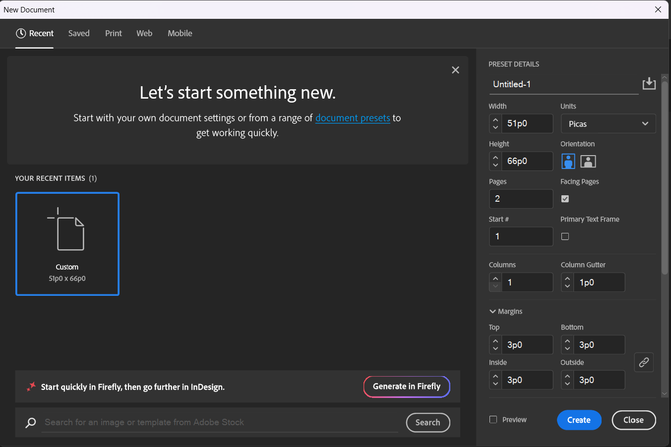
| Intent | InDesign's top-level choice between Print, Web, and Mobile — changes the default unit (inches vs. pixels) and color mode (CMYK vs. RGB) to match the destination. |
| Facing Pages | A setting that makes left/right pages mirror each other (like a real bound book or magazine), with an inside and outside margin instead of a simple left/right margin. |
| Columns | How many vertical text columns the page's margin guides are automatically divided into. |
| Slug | An area outside the bleed, used for printer's marks, job notes, or version info — never printed as part of the final piece, but useful during production. |
| Document Preset | A saved set of New Document settings (size, margins, columns, bleed) that can be reused instantly for future projects of the same type. |
Beyond page size and orientation, four settings decide almost everything about a document's structure:

A commercial printer's cutting blade is never perfectly precise to the pixel. If a colored background is designed to end exactly at the page's trim edge with zero bleed, even a tiny misalignment in cutting leaves a thin, obviously wrong sliver of white paper along that edge. Extending that background 0.125in past the trim edge (into the bleed area) means the cut can drift slightly and the final piece still looks intentional and edge-to-edge.
Create three separate new documents from the New Document dialog: (1) a single-page 5x7in postcard, Print intent, 0.125in bleed, no facing pages; (2) a 2-column, 8.5x11in single-sided flyer; (3) an 8-page, facing-pages booklet at half-letter size with 3 columns. Save all three with clearly labeled file names, and write one sentence per file explaining what real project each setup would suit.
InDesign's default workspace groups tools and panels around one core workflow: select or draw a frame, then fill it with text or a graphic. Getting comfortable with where things live saves real time across every later chapter.
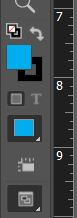
| Tools Panel | The vertical strip of icon tools on the left edge — Selection, Direct Selection, Type, Pen, Frame tools, and more. |
| Control Panel | The context-sensitive bar along the top that changes its options based on whatever tool or object is currently selected. |
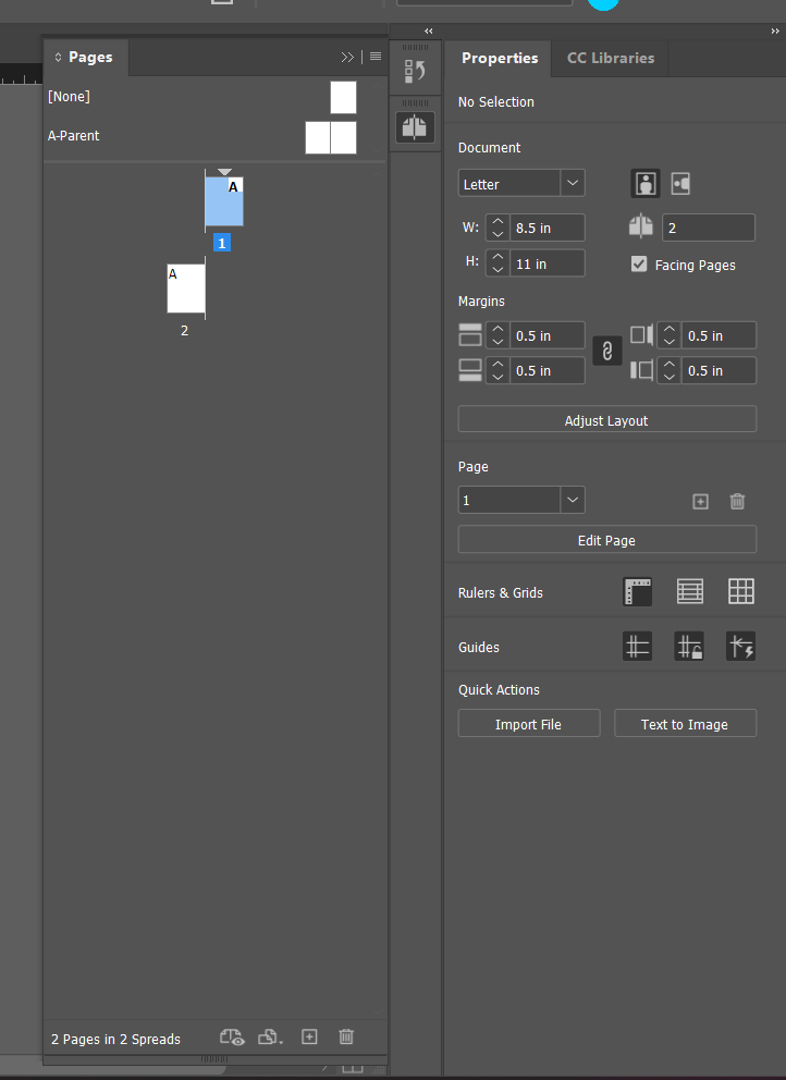
| Pages Panel | Shows every page and spread in the document as thumbnails; used to navigate, add, delete, and rearrange pages. |
| Properties Panel | A consolidated panel showing the most relevant settings for whatever's currently selected, without needing to hunt across several separate panels. |
| Workspace | A saved arrangement of which panels are open and where — InDesign ships with several (Essentials, Typography, Digital Publishing) and lets you save your own. |
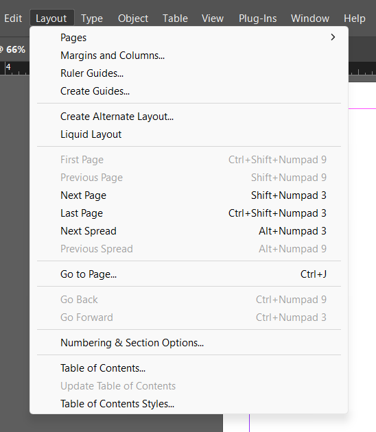
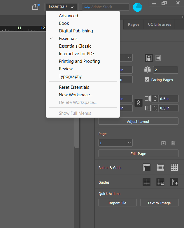
InDesign has two different selection tools that do genuinely different jobs, and mixing them up is one of the most common beginner mistakes:
This distinction — frame versus content — runs through the entire program. A photo placed in InDesign is really two things layered together: an outer frame (which crops/contains it) and the actual image content inside that frame, which can be repositioned, scaled, or swapped independently of the frame's own size and position.
Once panels are arranged the way you actually work (Window > Workspace > New Workspace), save it with a name. This matters more in InDesign than in most software, because a print-focused workspace (Swatches, Links, Preflight visible) and a heavily text-focused workspace (Paragraph Styles, Character Styles, Glyphs visible) genuinely benefit from being two different saved layouts you can switch between per project.
Open one of your Chapter 2.1 documents. Draw a rectangle frame and place any placeholder graphic into it (Chapter 2.4 covers Place properly — for now, any image works). Practice moving the whole frame with the Selection tool, then switch to the Direct Selection tool and reposition just the image inside the frame without moving the frame's edges. Write one sentence describing, in your own words, the difference in what each tool actually grabbed.
InDesign's page includes an entire layer of structural helpers that never show up in a printed or exported file — they exist purely to help a designer align, measure, and build accurately.
| Ruler | Horizontal and vertical measurement guides along the top/left of the document window, used to place ruler guides precisely. |
| Ruler Guide | A non-printing line dragged out from a ruler and placed anywhere on the page or pasteboard, used for custom alignment. |
| Margin & Column Guides | The non-printing guide lines automatically generated from a document's margin and column settings. |
| Smart Guides | Temporary alignment guides that appear automatically while dragging an object, snapping it to align with nearby objects' edges or centers. |
| Document Grid | An evenly-spaced non-printing grid covering the whole page, independent of the baseline grid. |
| Pasteboard | The gray working area surrounding the actual page — a place to stage content before it's placed on the page itself. |
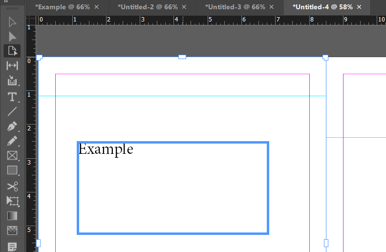
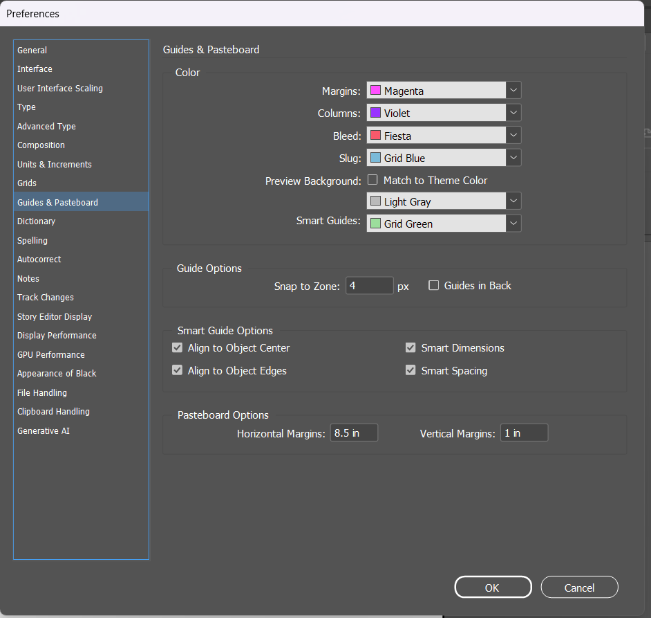
With View > Grids & Guides > Snap to Guides turned on (it usually is, by default), any object dragged near a guide "snaps" to align with it automatically — the single most common way a designer keeps a layout precisely aligned without eyeballing pixel positions manually.
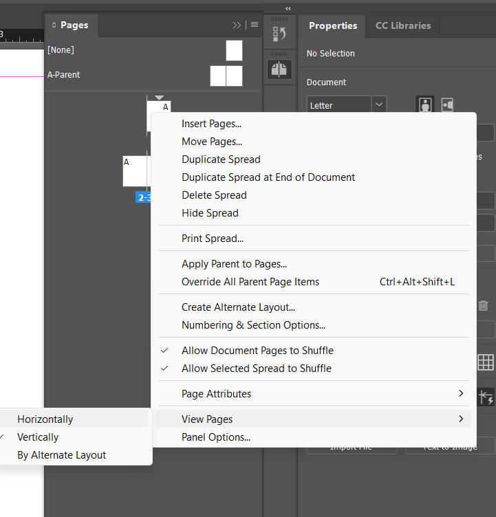
On graph paper, mark a rectangle representing a page. Draw dashed lines for margins, and a solid ruler-style edge along the top and left representing InDesign's rulers. Practice "placing a guide" by drawing one new dashed line at a specific measurement (e.g., 2 inches from the top) and label it with that measurement, the same way a real ruler guide would be positioned by typing an exact number.
In any document, drag out two ruler guides (one horizontal, one vertical) to exact positions using the Control panel's X/Y fields rather than eyeballing it. Draw a small rectangle frame and drag it near a margin guide until it snaps into alignment. Toggle View > Grids & Guides > Show Guides off and on to see the difference.
Almost nothing in a real InDesign document is created from scratch inside InDesign itself — photos, illustrations, and often long blocks of text all come from somewhere else and get placed into the layout. How that placement works, and what it means for keeping a project up to date, is one of InDesign's most important structural ideas.
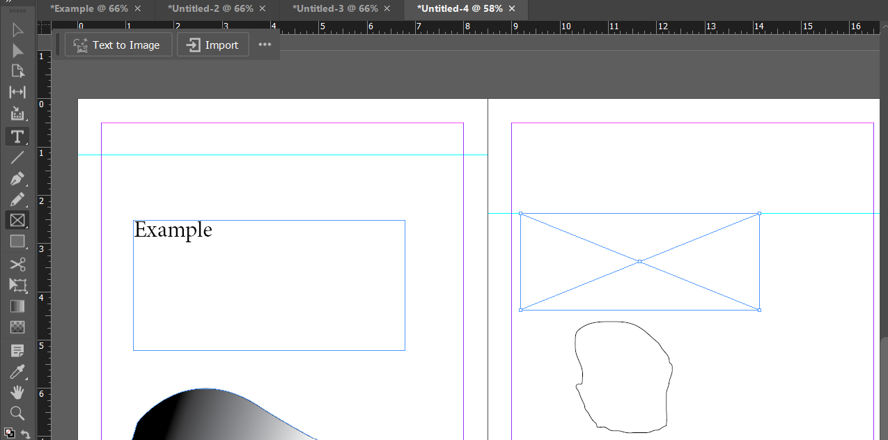
| Place | InDesign's command (File > Place, or Ctrl/Cmd+D) for importing an outside file — an image, a Word document, another InDesign file — into a frame. |
| Link | InDesign's default behavior for placed images: the document stores a reference/pointer to the original file, not a full copy of it. |
| Embed | Storing a full copy of a placed asset directly inside the InDesign file itself, instead of linking to the original. |
| Links Panel | Shows every placed asset in a document, its file location, and whether it's up to date, missing, or has been modified since being placed. |
| Creative Cloud Libraries | A shared, cloud-synced collection of colors, graphics, and text styles that can be dragged directly into any InDesign document. |
By default, InDesign links to placed images rather than embedding full copies. This keeps the InDesign file itself small, and — more importantly — means that if the original photo gets updated (a photographer delivers a color-corrected version, for example), InDesign can detect the change and offer to update the placed version automatically via the Links panel, instead of requiring the designer to manually re-place it. The tradeoff: a linked InDesign file is not self-contained — sending just the .indd file to someone else without also sending (or packaging, Chapter 6) its linked images means those images will show up missing on their end.

The Links panel flags two states a designer should never ignore before finalizing a project: a missing link (the original file has moved or been deleted — the placed image may still show a low-res preview, but the file has no real source anymore) and a modified link (the original file has changed since it was placed, and the document isn't showing the current version yet). Both need to be resolved — relink or update — before a file is considered finished.
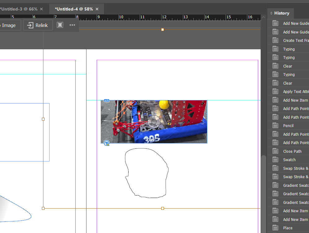
Place 2-3 images into a document using File > Place. Open the Links panel (Window > Links) and identify each image's file path. Rename or move one of the original image files outside InDesign (in your file browser), then return to InDesign — find and describe the warning icon that now appears in the Links panel, and practice using it to relink to the file's new location.
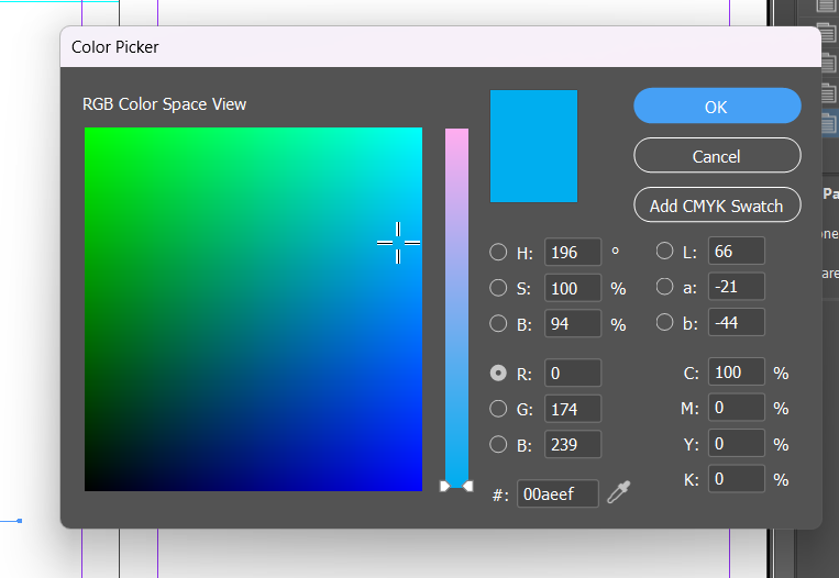
Color in InDesign is managed almost entirely through the Swatches panel rather than a floating color picker — a deliberate difference from Photoshop, because a publication needs the exact same colors to repeat, precisely, across potentially hundreds of pages, and a saved swatch guarantees that consistency in a way that repeatedly eyeballing a color picker never could.
| Swatch | A saved, named color stored in the Swatches panel and reused consistently throughout a document. |
| Process Color | A color built by mixing CMYK inks at print time — the standard for most full-color printed material. |
| Spot Color | A single, pre-mixed ink (like a Pantone color) printed exactly as specified, rather than built from CMYK at print time — used when exact, consistent color matching (a brand's exact logo color, for example) matters more than cost. |
| Pantone / PMS | A standardized color-matching system used industry-wide so a specific spot color prints identically regardless of printer or location. |
| Tint | A lighter percentage of an existing swatch (e.g. a 40% tint of a solid blue), saved and reused without creating an entirely new color. |
| Gradient | A smooth transition between two or more colors, built and saved in the Gradient panel. |
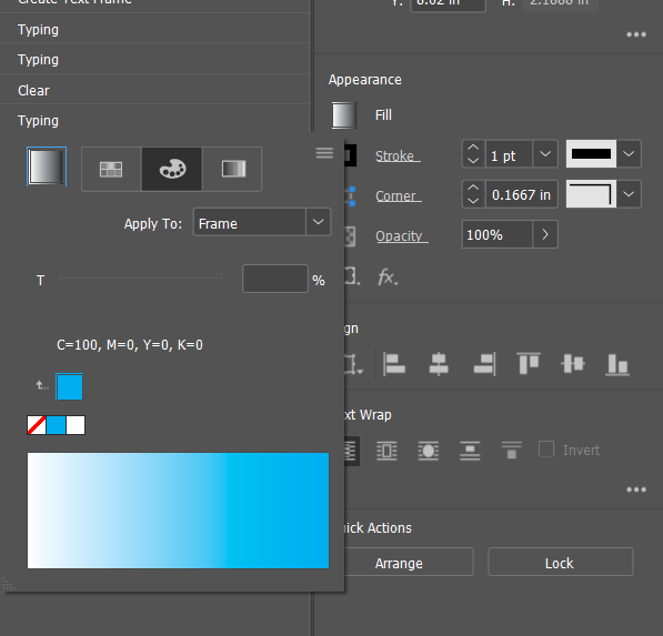
As in the Photoshop book: RGB (red, green, blue light) is for anything displayed on a screen; CMYK (cyan, magenta, yellow, black ink) is for anything printed. In InDesign specifically, a document's color mode should match its Intent (set back in 2.1) from the very start — building an entire print brochure in RGB and converting to CMYK only at the end risks visibly shifted colors, because CMYK's usable color range (gamut) is smaller than RGB's, and some bright RGB colors simply have no exact CMYK equivalent.
InDesign's Gradient panel offers Linear (colors transition along a straight line, in any angle) and Radial (colors transition outward from a center point in a circle) gradients. Both are built the same way: add color stops along the gradient ramp, and adjust each stop's color and position.
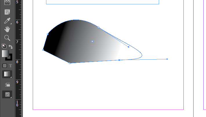
With colored pencils, create a small tint scale of one color: color a full-strength square, then 75%, 50%, and 25% tints of the exact same color next to it, labeled with their percentages — the analog version of what a saved tint swatch does digitally.
Create 3 new swatches in the Swatches panel: one CMYK process color, one from a Pantone spot-color library (Swatches panel menu > New Color Swatch > Color Mode > a Pantone library), and one 50% tint of your process color. Apply all three to different shapes on a page, then build one linear and one radial gradient using two of your saved swatches as the gradient's color stops.
Looking ahead: Chapter 3 moves from a single page's setup into organizing an entire document — layers for keeping content grouped and manageable, and the Pages panel's master pages, the single biggest time-saver for keeping a long publication consistent.
Chapter Three
03
A single flyer barely needs organizing. A 40-page yearbook, a 12-page brochure, or a magazine with recurring sections absolutely does — and InDesign's two biggest organizational tools, layers and master pages, are exactly what separates "a designer who can make one nice page" from "a designer who can run an entire publication."
This chapter covers both: layers, for controlling stacking and grouping content within a page, and pages/master pages, for keeping structure and repeated elements consistent across every page in a document at once.
InDesign's Layers panel works differently than Photoshop's. In Photoshop, layers usually represent separate pieces of one flat image. In InDesign, layers are a document-wide organizational tool — a single layer can contain content spread across every page of the document, and layers are most often used to separate entire categories of content (all body text on one layer, all photos on another, all guide/annotation content a designer wants to hide before export on a third).
| Layer | A document-wide, stackable container for grouping and organizing content, independent of which page that content is on. |
| Layer Visibility | Toggling a layer's eye icon to show or hide everything on it at once, across the whole document. |
| Layer Lock | Preventing everything on a layer from being accidentally selected or edited. |
| Stacking Order | The front-to-back arrangement of objects — both between layers, and between objects within the same layer. |
| Group | Multiple selected objects combined so they move, scale, and can be selected together as one unit. |
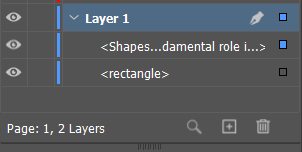
Imagine laying out a 12-page brochure with a printer's crop marks, private layout notes for a client review, and the actual finished design content all in the same file. Putting each of those on its own layer means the designer can hide the notes layer before sending a client-facing PDF, hide the crop-marks layer for an on-screen digital version, and show everything at once for their own working file — all from the same source document, without deleting or duplicating anything.
A common beginner mix-up: the Layers panel organizes content by category across the whole document; the Pages panel (next section) organizes the document by physical page. They're two completely independent systems working at the same time — a single page can contain content from five different layers, and a single layer can have content sitting on every page in the document.
In any multi-page document, create 3 layers: "Text," "Images," and "Notes." Add at least one object to each layer, on more than one page. Toggle each layer's visibility off and on individually, and lock the "Images" layer, then try (and fail) to select an image on it — confirm the lock is working before unlocking it again.
The Pages panel is where a designer adds, removes, reorders, and navigates a document's actual pages. Its single most powerful feature, though, is master pages — the tool that makes a 40-page document manageable at all.
| Master Page | A template page whose content (page numbers, headers, footers, repeated design elements) automatically applies to every regular page linked to it. |
| Applying a Master | Assigning a master page's content to one or more regular document pages, in the Pages panel. |
| Override | Breaking a specific instance of a master-page item on one regular page so it can be edited individually, without affecting the master or other pages. |
| Section | A named, independently-numbered range of pages within one document (e.g., front matter numbered in roman numerals, the main body starting over at "1"). |
| Insert Pages | Adding new pages to a document, with control over how many, where, and which master they use. |
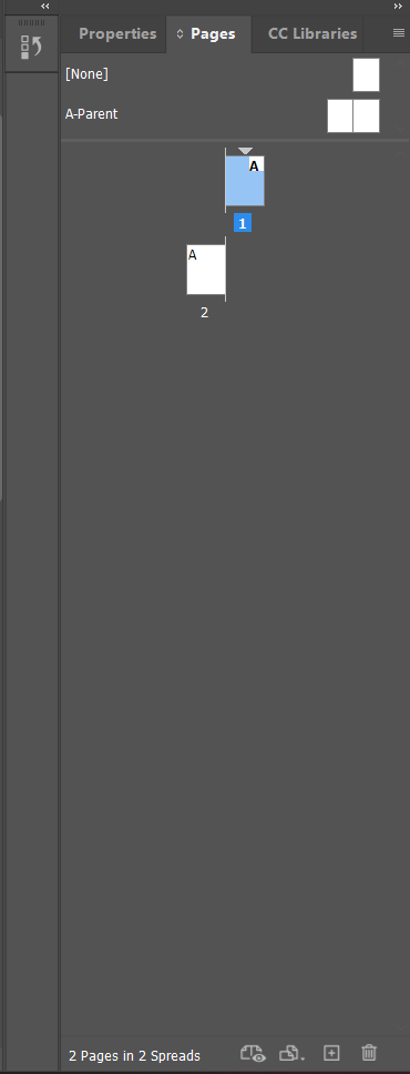
Imagine a 40-page yearbook needs a page number and the school's logo in the same corner of every single page. Without master pages, that's 40 separate manual placements — and if the logo needs to move later, that's 40 separate manual fixes. With a master page, the logo and an automatic page number (a special current page number character, which displays the correct number on every page it's used on) are placed once, on the master, and every page linked to that master instantly shows them, correctly numbered, forever. Change the master, and every linked page updates at once. This single feature is most of why InDesign exists as a separate program from Photoshop or Illustrator at all — neither is built to manage "the same design decision, repeated correctly across 40 pages."
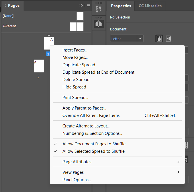
Sometimes one specific page needs to break from the master — a chapter-opener page that doesn't want the running header, for example. Ctrl/Cmd+Shift+clicking a master item on a regular page overrides it, detaching that one instance so it can be edited or deleted on that page alone, without touching the master or any other page that still uses it.
Sketch a simple master-page template by hand: a small rectangle representing a page, with a placeholder logo box in one corner and "##" marking where an automatic page number would go. Then sketch 3 "regular pages" using that same master layout, each with different main content but the logo/page-number position identical across all three — the analog version of what applying a master does automatically.
In an 8-page document, open the Pages panel and edit the "A-Master." Add a text frame with an automatic page number (Type > Insert Special Character > Markers > Current Page Number) in a bottom corner, plus a simple shape representing a logo. Apply that master to all 8 pages (drag it onto each, or select all in the Pages panel and apply at once). Confirm every page now shows a correctly incrementing page number, then override and delete the logo shape on just one page without affecting the others.
Looking ahead: Chapter 4 goes deep on InDesign's other core strength — text. Adding and flowing text, building paragraph and character styles (the text equivalent of what master pages just did for whole pages), and working with tables.
Chapter Four
04
Most of what a reader actually spends time doing with a publication is reading its text. This chapter is the largest domain on the real exam for a reason — text handling is InDesign's single deepest, most distinguishing skill set, well beyond what Photoshop or a word processor can do.
Covered here: getting text into a document and controlling how it flows, building paragraph and character styles for effortless consistency, real editing techniques beyond typing, and working with tabular data.
Text in InDesign always lives inside a text frame — drawn with the Type tool the same way a graphic frame is drawn with a frame tool. Text can be typed directly, pasted, or placed from an outside file (Word document, plain text file, even another InDesign story).
| Text Frame | A container that holds and displays text, created with the Type tool. |
| Threading / Linking | Connecting two or more text frames so overflow text automatically continues from one into the next. |
| Overset Text | Text that doesn't fit within its text frame(s) — marked by a small red plus sign in the frame's bottom-right corner, always something to fix before finishing a document. |
| Story | All the text within one chain of threaded text frames, treated as a single continuous flow for editing purposes. |
| Placeholder Text | Dummy filler text (Type > Fill With Placeholder Text) used to test a layout's look before real content is ready. |
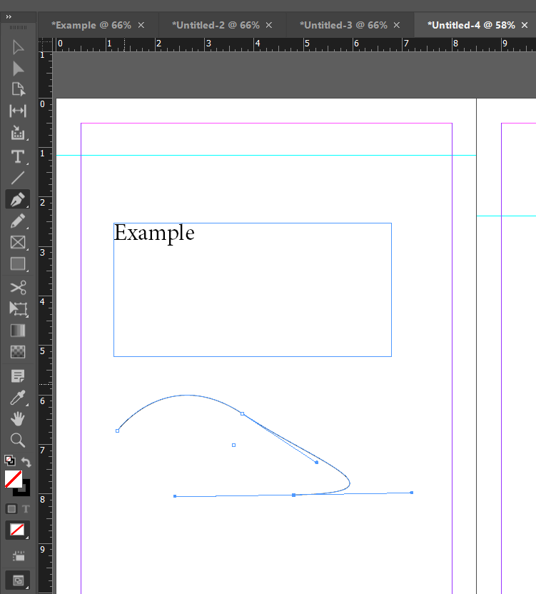
Click the small red overset icon (or the out-port at a frame's bottom-right corner) with the Selection tool, then click inside another frame — even one on a completely different page — and the two frames become threaded. Text now flows continuously between them: type more into the first frame, and once it's full, the overflow automatically appears in the linked frame, exactly the way a real magazine article says "continued on page 9" and picks up seamlessly.
A red overset icon means real content exists in the file that no reader will ever see — it's cut off, invisible, gone from the reader's experience even though it's technically still in the document. Before finishing any real project, every story needs to be checked for overset text: either the frame needs to grow, the text needs threading to another frame, or the copy itself needs to be edited down to fit.
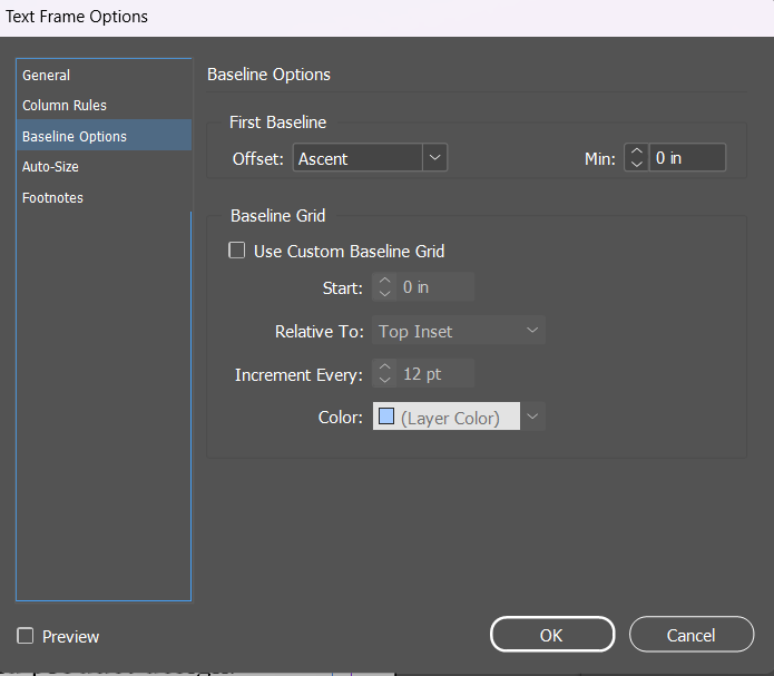
Draw a small text frame and use Type > Fill With Placeholder Text to overfill it deliberately — confirm you can see the red overset icon. Draw a second, empty text frame elsewhere on the page (or on another page). Thread the two together and confirm the overset text now flows into the second frame and the red icon disappears.
If master pages are how InDesign keeps whole-page structure consistent, styles are how it keeps text formatting consistent — and the underlying idea is identical: define a formatting decision once, apply it everywhere it's needed, and change it in one place to update every use at once.
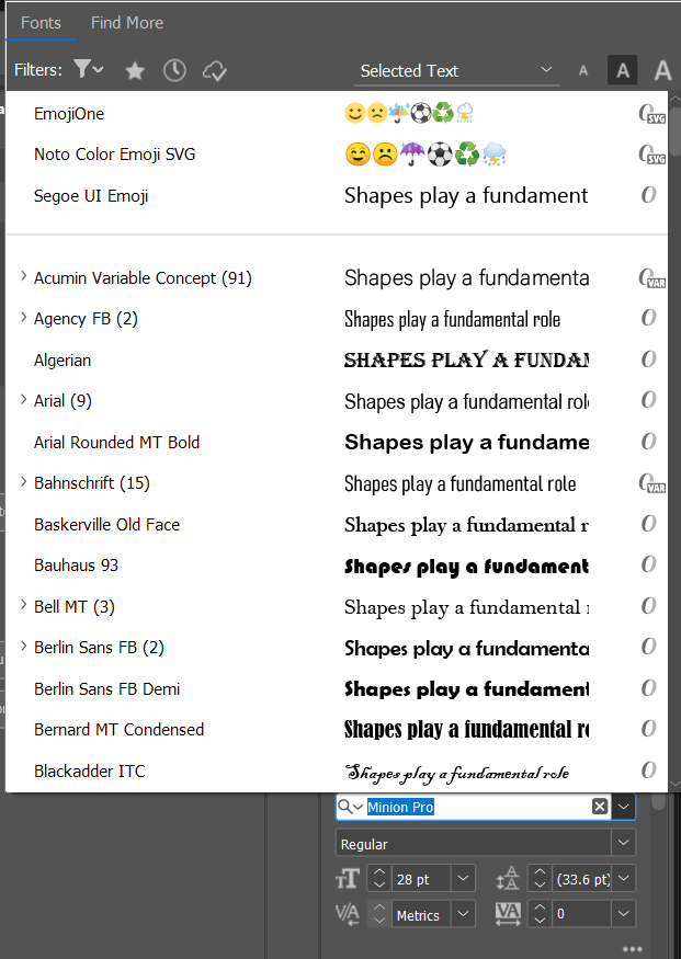
| Paragraph Style | A saved set of formatting (font, size, spacing, alignment, indents) applied to an entire paragraph at once. |
| Character Style | A saved set of formatting applied to a specific range of selected text within a paragraph — for things like bolding one word or styling a byline differently from the sentence around it. |
| Based On | A style built as a variation of another existing style, inheriting its settings and updating automatically if the parent style changes. |
| Next Style | A paragraph style setting that automatically applies a different, specified style to the very next paragraph typed — e.g., a Heading style whose Next Style is set to Body Text. |
| Redefine Style | Updating a style's saved definition to match formatting changes made directly to one instance of text, so every other use of that style updates to match. |
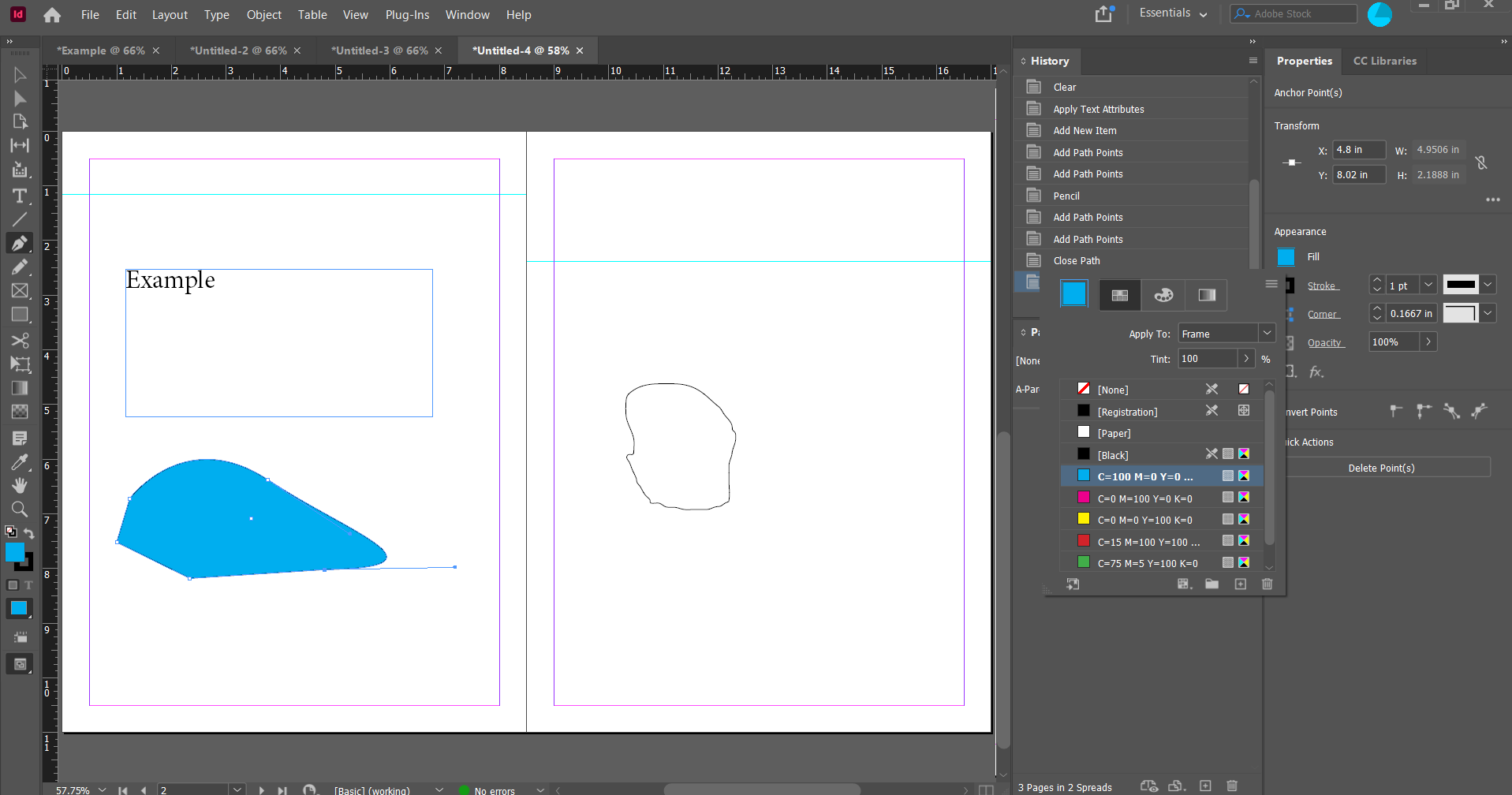
![InDesign's Properties panel with a Paragraph Styles / Character Styles toggle, showing "[Basic Paragraph]+" selected, plus Character settings for Minion Pro at 34pt and paragraph alignment icons below.](images/layout-path/4.2-paragraph-character-styles-panel.png)
Use a paragraph style for anything that applies to a whole paragraph at once: body text, headings, captions, block quotes. Use a character style for formatting that only applies to part of a paragraph: a bolded key term inside a sentence, a colored byline within a caption, italicized foreign words scattered through body copy. A well-built document typically layers both — a paragraph style for the overall body text, with character styles applied on top for specific emphasized words within it.
Imagine a 40-page document has 200 headings, all manually bolded, sized to 18pt, and colored blue. If the client later asks for headings to be 20pt and a different color, that's 200 manual fixes — and it's very easy to miss a few, leaving the document visibly inconsistent. With a Heading paragraph style applied to all 200 instead, editing the style's definition once updates all 200 headings simultaneously, correctly, with zero risk of missing one.
In a document with several paragraphs of placeholder text, create a "Heading" paragraph style (bold, larger size, a distinct color) and a "Body" paragraph style (regular weight, smaller, black), and apply each to the appropriate text. Create one character style ("Highlight," bold + a bright color) and apply it to 2-3 individual words scattered through the body text. Then edit your Heading paragraph style's color and confirm every heading updates at once.
Beyond typing and formatting, InDesign includes real editing tools for finding, fixing, and refining text at scale — essential once a document has real, lengthy copy rather than a few short labels.
| Find/Change | Searches for and replaces specific text (or specific formatting) throughout a document, a story, or selected text. |
| Story Editor | A distraction-free, plain-text editing view of a story's content, useful for proofreading or bulk-editing long text without layout distractions. |
| Spell Check | Scans document text against a dictionary and flags likely misspellings. |
| Track Changes | Records edits made to text (insertions, deletions) so they can be reviewed and accepted or rejected, similar to a word processor. |
| Glyph | A specific character in a specific font, accessible through the Glyphs panel — useful for special characters not on a standard keyboard (em dashes, fractions, accented letters, symbols). |
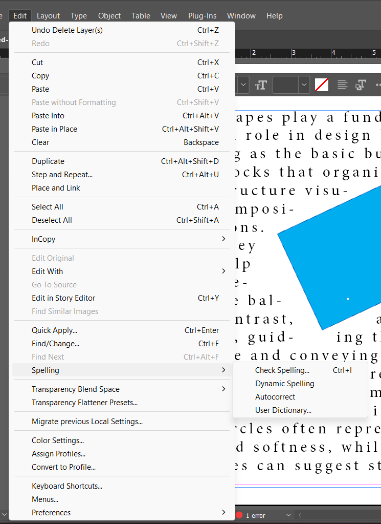
Find/Change can search and replace by formatting as well as text — for example, finding every instance of a specific font and swapping it for another across an entire document in one pass, or finding every double space and replacing it with a single space. This is dramatically faster and more reliable than manually hunting through pages of text.
In a document with several paragraphs of text, deliberately introduce 2-3 spelling errors, then run Edit > Spelling > Check Spelling and fix them. Open the Story Editor (Edit > Edit in Story Editor) for that same text and make one edit there, then switch back to Layout view and confirm the change appears correctly in the actual page layout. Use Find/Change to replace every instance of one specific word throughout the story.
InDesign builds real, structured tables — not just a grid of text boxes lined up by eye — with the same styling logic as text: consistent formatting applied through table and cell styles, the same way paragraph styles work for body text.
| Table | A structured grid of rows and columns, created inside a text frame, for organizing tabular data. |
| Cell | One individual box within a table, at the intersection of a row and column. |
| Header Row | A row (or rows) set to repeat automatically at the top of a table if it spans across threaded frames or multiple pages. |
| Table Style / Cell Style | Saved formatting for a table's overall structure, or for individual cells, reusable across multiple tables the same way paragraph/character styles work for regular text. |
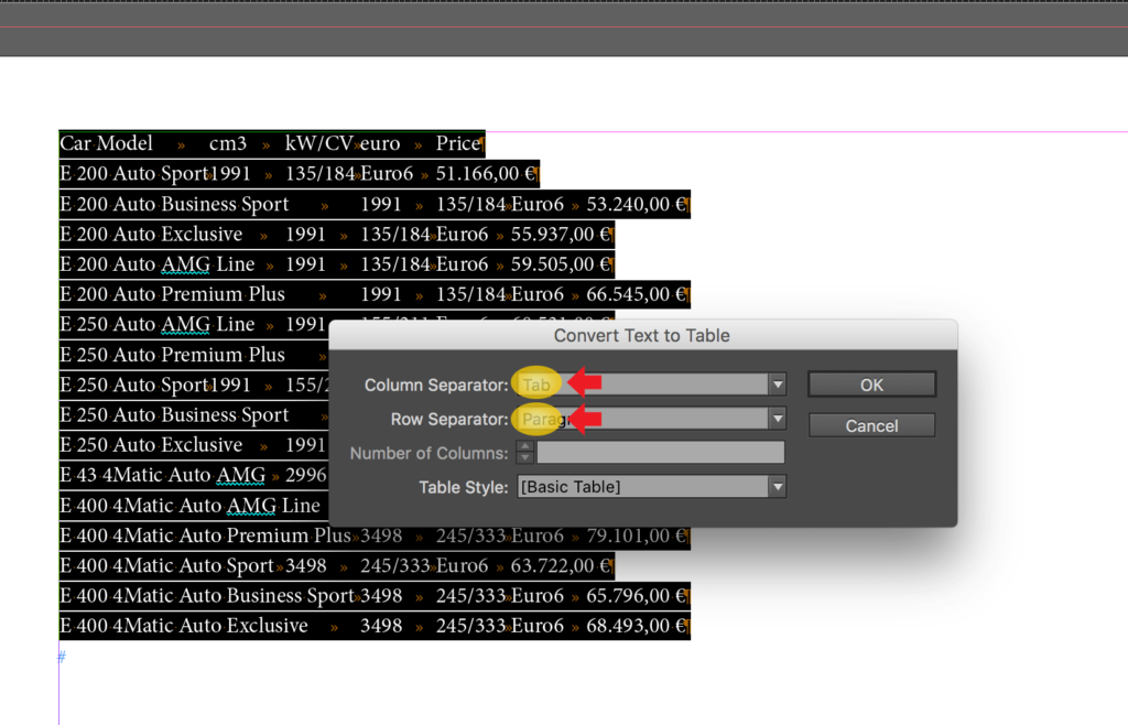
| Convert Text to Table | Turning existing tab- or comma-separated text into a real, structured InDesign table automatically. |
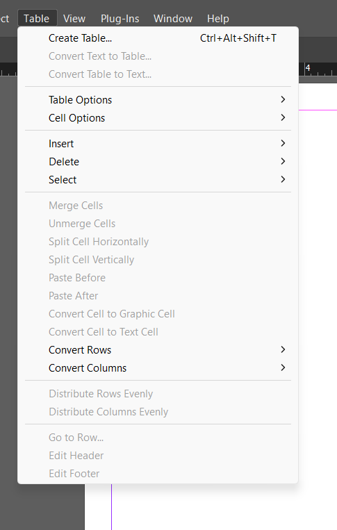
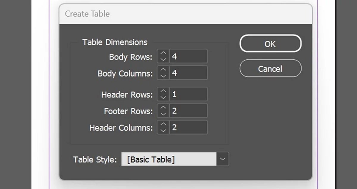
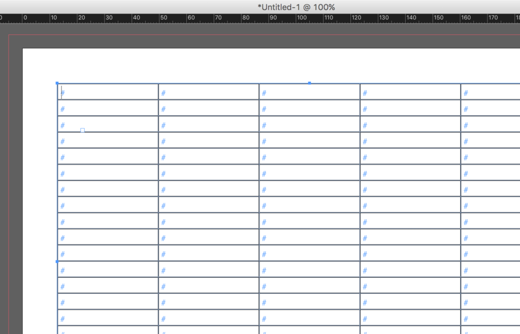
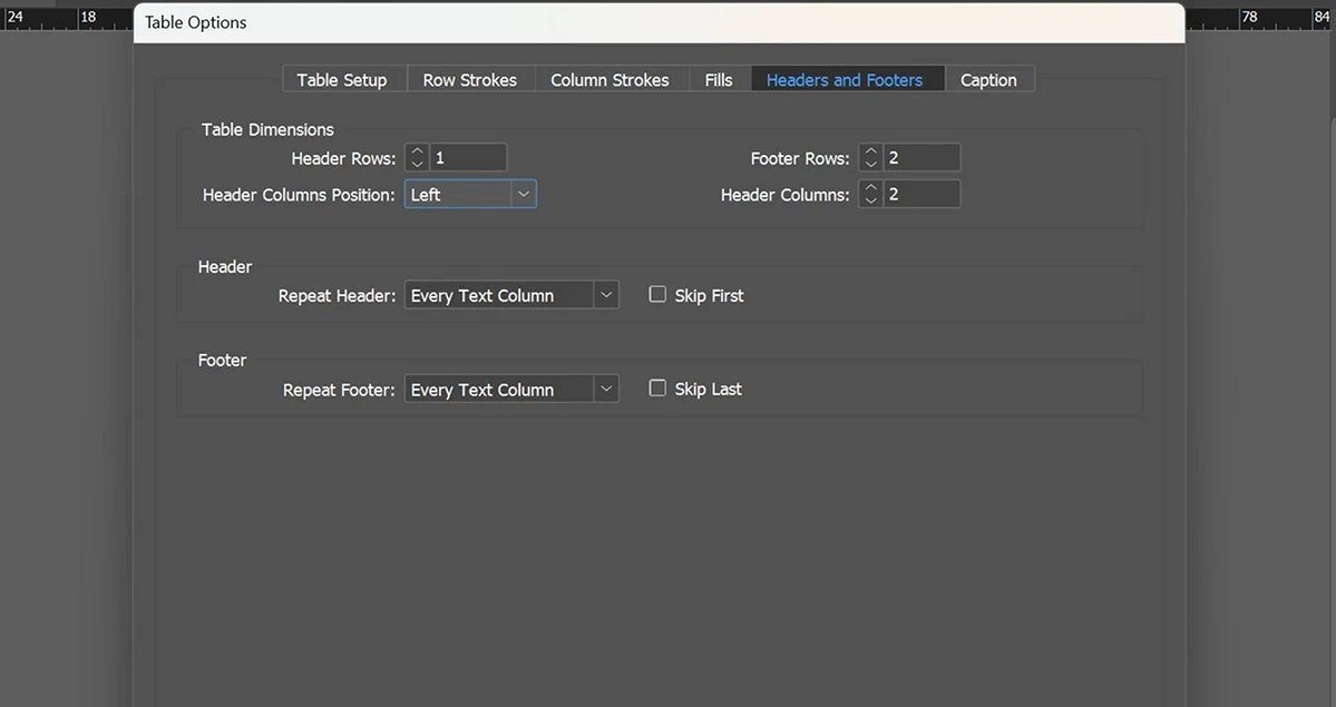
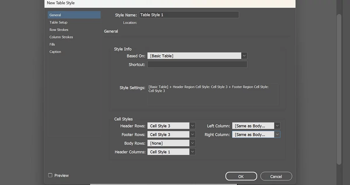
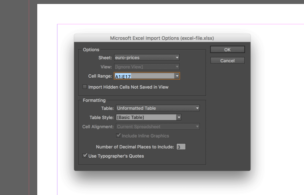
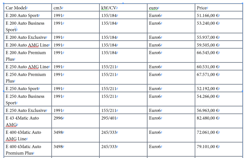
A very common real workflow: a client sends a spreadsheet or a tab-separated list of data (prices, a schedule, a roster). Rather than manually recreating that structure cell by cell, select the tab-separated text inside InDesign and use Table > Convert Text to Table — InDesign reads the tabs (as column breaks) and paragraph returns (as row breaks) and builds a real, editable table instantly. An actual Excel file can skip that step entirely: File > Place a .xlsx directly, and InDesign's Import Options let you pick the sheet, the cell range, and whether it comes in as a formatted or unformatted table.
By hand, draw a simple 4-column, 5-row table (a class schedule, a price list, a sports roster) with a clearly bolded header row. Add alternating light shading to every other row by hand-coloring it lightly — the analog version of a table style's alternating-fill feature.
Type a short list of tab-separated data (3-4 columns, several rows) into a text frame. Select it and use Table > Convert Text to Table. Format the header row bold with a colored fill, and use Table > Table Options > Alternating Fills to apply automatic alternating row shading.
Looking ahead: Chapter 5 shifts from text back to visual elements — the core layout tools, transforming and modifying graphics, adding interactivity for digital publications, and InDesign's newest generative AI features.
Chapter Five
05
Text carries most of a publication's information, but visual elements — photos, illustrations, shapes, and increasingly, AI-generated imagery — carry most of its first impression. This chapter covers the tools that build and refine everything on a page that isn't text.
Covered here: the core frame and drawing tools, transforming graphics, modifying how they appear, adding interactivity for digital publications, and InDesign's newest Firefly-powered AI features.
Almost every visual element in InDesign starts as a frame — a container shape drawn with the Rectangle, Ellipse, or Polygon Frame tools (each with an X inside its icon, signaling it's meant to hold content) or the equivalent plain shape tools (no X, meant to hold color/stroke rather than placed content, though InDesign lets either type do either job).
| Frame | A container shape (rectangle, ellipse, or polygon) meant to hold placed text or graphic content. |
| Fitting | How placed content resizes relative to its frame — options include Fill Frame Proportionally, Fit Content Proportionally, and Fit Frame to Content. |
| Pen Tool | Draws precise custom paths and shapes using anchor points and direction handles, the same tool and concept as in Photoshop and Illustrator. |
| Stroke | The visible outline/border of a shape or frame — its weight, color, and style (solid, dashed, dotted) are all independently adjustable. |
| Corner Options | Adjusts a rectangle frame's corners (rounded, beveled, inset, and more) without needing the Pen tool. |
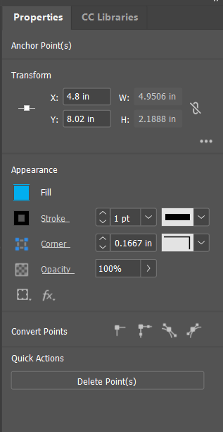
When an image is placed into a frame that isn't exactly the same proportions as the image itself, InDesign needs to know how to reconcile the difference. Fill Frame Proportionally scales the image to completely fill the frame (cropping any excess) — the most common choice for a clean photo placement. Fit Content Proportionally scales the image to fit entirely within the frame (possibly leaving empty space on two sides). Checking Object > Fitting after every placement is a habit that prevents a surprisingly common beginner mistake: a stretched, distorted photo because fitting wasn't set at all.
Dragging a frame's corner handle without holding Shift (or without a proportional fitting option set) stretches the image inside it out of proportion — people's faces get subtly (or obviously) warped, and it reads as an amateur mistake instantly to anyone looking at the finished piece. Always confirm proportional fitting before finalizing any placed photo.
Draw 3 differently-shaped/proportioned frames and place the same image into all three. Set one to Fill Frame Proportionally, one to Fit Content Proportionally, and one to Fit Frame to Content. Compare the results and write one sentence per option describing what actually happened to the image.
Once an object exists on the page, InDesign offers precise, numeric control over its position, size, and orientation — both by eye (dragging) and by exact measurement, which matters far more in publication work than in most other design contexts, since consistent sizing across many repeated elements (photo grids, icon sets) is often required.
| Free Transform | A single tool combining move, scale, and rotate into one interactive operation. |
| Scale | Resizing an object, ideally proportionally (holding Shift, or using the Control panel's linked width/height fields). |
| Rotate | Turning an object around a defined reference point. |
| Shear | Slanting an object along an axis, distorting its shape while keeping its edges straight. |
| Reference Point | The fixed point (one of nine positions on an object's bounding box) that a transform is calculated from. |
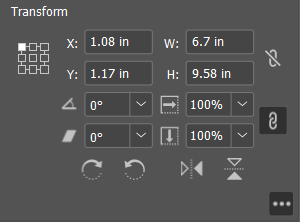
For anything that needs to match exactly — four photos that all need to be precisely 2 inches wide, an icon rotated to exactly 45 degrees — typing the exact value into the Control panel's W/H/rotation fields (rather than dragging by eye) guarantees consistency in a way that's nearly impossible to achieve reliably by hand.
Place the same small graphic 4 times on a page. Using the Control panel's numeric fields (not dragging), set all 4 to exactly the same width and height, then rotate each one to a different exact angle (0°, 15°, 30°, 45°) using the rotation field. Confirm all 4 stayed exactly the same size throughout.
Beyond basic fill and stroke color, InDesign offers effects and blending options for refining how an object looks on the page — similar in spirit to Photoshop's layer styles, applied to any object.
| Effects | Non-destructive visual modifications (drop shadow, glow, bevel, feather) applied to an object, editable or removable at any time. |
| Opacity | An object's transparency level, from fully opaque to fully see-through. |
| Blend Mode | Controls how an object's colors mathematically combine with whatever sits beneath it, the same core concept as Photoshop's blend modes. |
| Text Wrap | Forces surrounding text to flow around an object's shape (or a custom-defined boundary) rather than running underneath it. |
| Object Style | A saved, reusable set of appearance settings (fill, stroke, effects) applied to a frame or shape — the object-level equivalent of a paragraph style. |
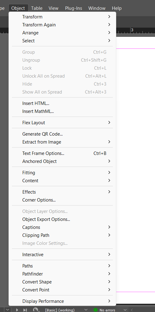
Place a photo in the middle of a column of body text with no text wrap set, and the text simply runs underneath the image, invisible and wasted. Select the image and open Window > Text Wrap — choosing "Wrap around bounding box" (or a custom shape) makes the surrounding text automatically flow around the image instead, the way a real magazine layout handles a photo dropped into a column of copy.
Fill a text frame with several paragraphs of placeholder text. Place a small image on top, roughly in the middle of the column. Apply Text Wrap (bounding box) and watch the text reflow around it. Then add a drop-shadow effect to the image via the Effects panel (Object > Effects > Drop Shadow), and reduce its opacity to about 70%.
A publication headed for a digital destination (an interactive PDF, an EPUB, a published-online document) can include real interactive elements a printed piece never could — built through the same InDesign document, using the same layout, just with an added interactive layer.
| Hyperlink | Clickable text or an object linking to a URL, an email address, or another page/destination within the document. |
| Button | An interactive object that can trigger an action (go to a page, open a URL, play media) when clicked in an exported interactive PDF or published document. |
| Bookmark | A named jump-point shown in an exported PDF's navigation panel, letting a reader click straight to a specific section. |
| Page Transition | An animated effect (dissolve, page turn, slide) applied when moving between pages in certain exported formats. |
| Liquid Layout | Rules that let one InDesign document intelligently adapt its layout across different page sizes or orientations, especially for multi-device digital publishing. |
Interactivity is the clearest example of Chapter 1's print-vs-digital decision mattering all the way through a project. A hyperlink, a button, and a page transition are all completely invisible and meaningless in a printed piece — they only matter, and only export correctly, when a document is headed for an interactive PDF or digital publishing format (Chapter 6).
In a short document, select a piece of text and add a hyperlink to a real website (Window > Interactive > Hyperlinks). Create a simple rectangle, convert it to a Button (Window > Interactive > Buttons and Forms), and set its action to "Go to Next Page." Export as an Interactive PDF (covered fully in Chapter 6) and test that both the hyperlink and the button actually work in a PDF viewer.
InDesign includes several Adobe Firefly-powered generative AI features, all built into the app at no extra cost with an existing InDesign license, and designed for commercial-safe use (Firefly's training data is licensed content, Adobe Stock, and public domain material — a real reason it's positioned as safer for paid client work than some other AI image tools, whose training data and licensing status may be unclear).
| Text to Image | Generates original images directly inside InDesign from a written text prompt, producing several variations to choose from. |
| Generative Fill | Transforms vector graphics into fully rendered artwork based on a text prompt (currently a beta feature). |
| Generative Expand | Extends an existing placed image outward to fill a larger frame, generating plausible new image content beyond its original edges. |
| AI-Generated Alt Text | Automatically writes a draft accessibility description for a placed image, which a designer should always review and refine, not use unedited. |
| AI Assistant / Rewrite | AI-assisted text tools for rewriting or adjusting existing copy directly within InDesign. |
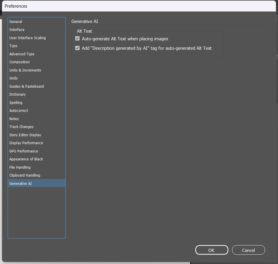
Just because a feature is "built into InDesign" doesn't remove the copyright questions from Chapter 1 — a client project using AI-generated content still needs the same honesty about what was AI-generated, and the same caution about a client's specific policies on AI use, that this book series has flagged since Book Three. Always confirm with a client whether AI-generated imagery is acceptable for their project before relying on it in paid work.
Using the Text to Image panel, generate a small illustration from a written prompt describing something relevant to a real class project. Place one of the generated variations into a frame. Then place a real photo and use Generative Expand to extend it beyond its original edges to fill a wider frame. Write 2-3 sentences on how well each result matched what you actually asked for, and one thing you'd change about your prompt.
Looking ahead: Chapter 6 covers the final step of any project — preparing a finished document for real-world publishing, whether that's a professional printer or a digital export.
Chapter Six
06
A design is only finished once it's actually delivered in a form the next person in the chain — a printer, a client, a reader — can actually use. This is the step where small oversights from earlier chapters (a missing link, an overset text frame, the wrong color mode) turn into real, expensive problems if they aren't caught first.
This chapter covers checking a document before it ships, and the different ways a finished InDesign file can actually be delivered — to a professional printer, or as a digital export.
Before exporting anything, a professional workflow checks a document for problems that would otherwise only surface after it's already at the printer, or already in a client's hands.
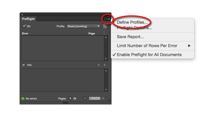
| Preflight | An automated check that scans a document for common production errors — missing fonts, missing/modified links, overset text, low-resolution images, incorrect color mode — and flags them before export. |
| Live Preflight | Preflight running continuously in the background, showing a red or green status indicator at the bottom of the document window at all times. |
| Package | A command that collects a document's fonts, linked graphics, and a summary report into one self-contained folder — everything a printer or another designer needs to open the file correctly, with nothing missing. |
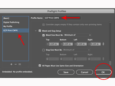
| Preflight Profile | A named, saved set of rules Preflight checks against — the default profile catches most common issues, but a print shop may supply its own custom profile with stricter requirements. |
The small colored dot in the bottom-left corner of the document window (red = errors found, green = clean) is running Live Preflight continuously. A document should never be exported or packaged for delivery while that indicator is red — double-clicking it opens the Preflight panel with a specific, actionable list of exactly what's wrong and where.
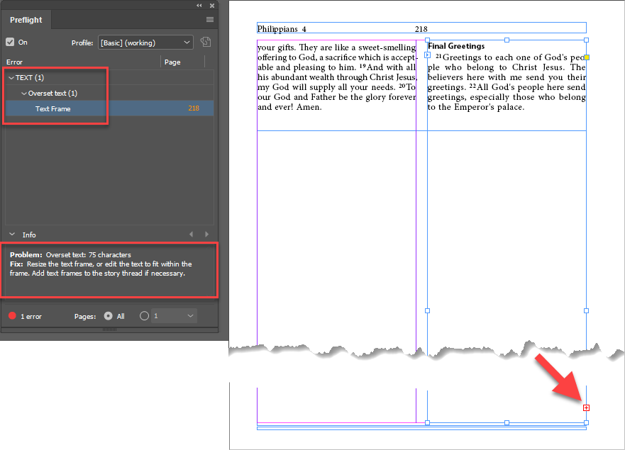
That small red square with a plus sign, in the bottom-right corner of a text frame, is the overset icon — it means the frame is holding more text than it can display, and the excess (invisible on the page, not deleted) picks back up wherever the story is threaded to next. Preflight's Overset Text error and this icon are reporting the exact same problem; the icon just puts it directly on the page, right at the frame that needs fixing, instead of only in a list.
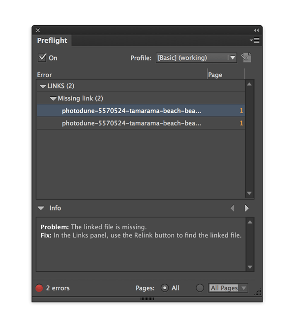
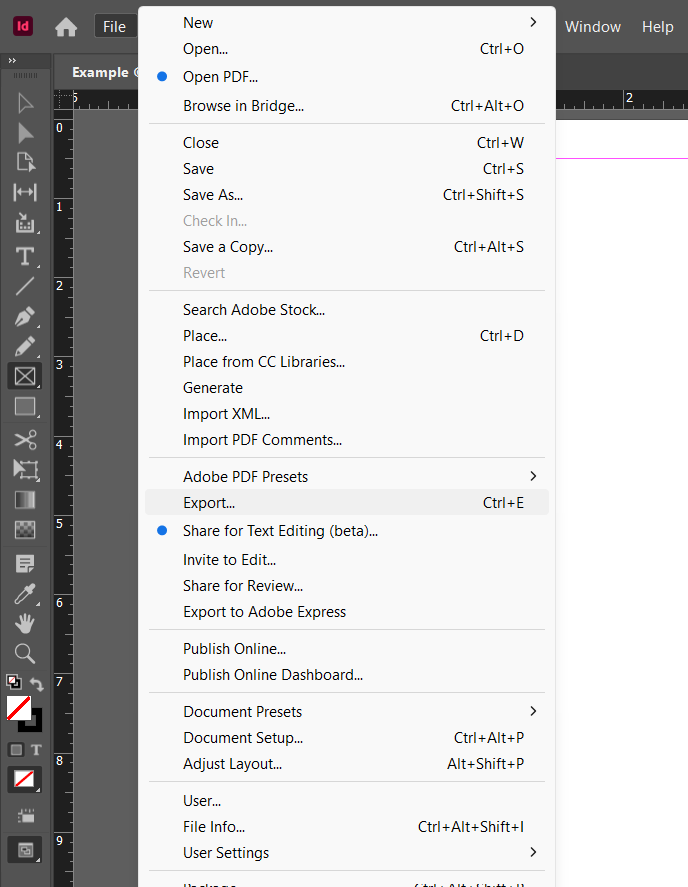
Recall Chapter 2.4: InDesign links to images rather than embedding them. That means the .indd file alone is not self-sufficient — sending it to a printer or another designer without its linked assets means those images show up broken on their end. File > Package solves this: it gathers copies of every linked image, every font used, and the .indd file itself, plus an instructions/report text file, into one folder — genuinely everything the next person needs, correctly, without them having to track down a single missing piece.
Take a document from an earlier chapter's exercise. Check its Preflight indicator — if it's red, open the Preflight panel and fix every issue it lists until it turns green. Then use File > Package to collect the document, its fonts, and its links into one folder. Open that folder afterward and confirm it actually contains a Fonts subfolder, a Links subfolder, and the report.
The correct export format depends entirely on where a document is going — the same print-vs-digital decision from Chapter 1, resolved for real at the very end of a project.
| PDF (Print) | A high-resolution export preset built for professional printing — includes bleed, embeds fonts, and preserves CMYK color accurately. |
| PDF (Interactive) | An export preset for on-screen/digital delivery, preserving hyperlinks, buttons, and page transitions, at a smaller/screen-appropriate resolution. |
| .indd | InDesign's own native, fully-editable file format. |
| .idml | An InDesign Markup file format used to open a document in an older version of InDesign than the one it was saved in. |
| EPUB | A reflowable digital book format, readable on e-readers and tablets, that adapts its layout to different screen sizes. |
| Publish Online | Adobe's own hosting service for sharing an InDesign document as a scrollable, shareable web page, without a separate export file at all. |
"Export as PDF" is not one single choice — the Print preset and the Interactive preset produce genuinely different files. A print-bound PDF needs bleed marks, embedded fonts, and CMYK color preserved exactly; a digital-bound PDF needs a smaller file size, RGB color (since it's only ever viewed on a screen), and its interactive elements (Chapter 5.4) intact and functional. Sending the wrong preset to a printer (an Interactive PDF, RGB, no bleed) is a common, entirely avoidable production mistake.
![InDesign's Adobe PDF Presets submenu, listing Define..., [High Quality Print], [PDF/X-1a:2001], [PDF/X-3:2002], [PDF/X-4:2008], [Press Quality], and [Smallest File Size].](images/layout-path/6.2-pdf-presets-submenu.png)
InDesign's native .indd format is generally not backward-compatible — a file saved in a newer version of InDesign often can't be opened directly in an older version. .idml (File > Export > InDesign Markup) solves this specific problem: exporting to .idml, then opening that file in an older InDesign version, works even when opening the original .indd file directly wouldn't. This matters constantly in real studio environments where not everyone upgrades software on the same schedule.
Take your packaged document from 6.1 and export it two ways: once using the [Press Quality] or a Print PDF preset (confirm bleed marks appear if you turn on printer's marks in the export dialog), and once using the [Smallest File Size] or Interactive PDF preset. Compare the two resulting file sizes and open both in a PDF viewer — if your document had a hyperlink or button from Chapter 5.4, confirm it works in the Interactive export and note whether it's present at all in the Print export.
Looking ahead: Chapter 7 closes the book with the exam itself — what the real Adobe Certified Professional InDesign exam actually looks like, and how to get set up to take it.
Chapter Seven
07
Everything in Chapters 1–6 maps directly to the real, current Adobe Certified Professional exam for InDesign — this short closing chapter is about the exam itself: its format, how to get registered, and how to actually prepare in the weeks before test day.
The 6 domains this book is built around — Working in the Design Industry, Project Setup and Interface, Organizing Documents, Creating and Modifying Text and Tables, Adding and Modifying Visual Elements, and Publishing Documents — are Adobe's own real, current exam blueprint, verified directly against certifiedprofessional.adobe.com/indesign.
Like the current Photoshop exam, the InDesign exam runs through Certiport's Compass testing engine as a Live-in-the-Application (LITA) exam — it loads as a panel inside a real, running copy of InDesign, and you complete short, timed tasks directly in the actual application ("create a 2-column document with these exact margins," "apply this paragraph style") rather than answering multiple-choice questions about screenshots. The exact number of questions, time limit, and passing score weren't published on the general exam-overview pages checked while writing this book — always confirm the current, exact numbers directly at certiport.pearsonvue.com rather than trusting any one source (including this book) to stay permanently up to date.
The practice-test platform GMetrix is what many schools, including this one, use to rehearse. Know going in that GMetrix's practice-test style can feel a little different from the live, inside-InDesign Compass format of the real exam — practice both knowing your vocabulary and being fast and accurate actually clicking through the real tools.
Set both of these up early — not the week of the exam.
Because the real exam is task-based, not just multiple-choice, the most effective preparation combines two different kinds of practice:
A realistic weekly rhythm in the run-up to test day: one GMetrix practice test, a fresh review of that week's chapter glossary, and one hands-on redo of that chapter's exercises without notes.
That's the whole book. Seven chapters, six real exam domains, one consistent structure throughout: concept first, vocabulary next, hands-on practice last. The same habits that make this book's exercises easier — checking Preflight before every export, building styles instead of manually reformatting, keeping links organized — are exactly the habits that make someone good at this job for real, not just good at passing one exam.
Back Matter
Every fact, tool description, and exam detail in this book was checked against a real, named source. This section collects all of them in one place, organized by how they were used.
| Adobe Certified Professional Exam Objectives1 | “Print & Digital Media Publication Using Adobe InDesign,” published by Certiport, a business of NCS Pearson, Inc. The authoritative source for this book's 6 core chapters and their exact domain breakdown, verified September 2026. |
| Adobe InDesign Help2 | Adobe's own official documentation site — the authoritative reference for verifying interface facts, menu paths, dialog names, and terminology throughout this book, including Chapter 5.5's Firefly-powered AI features. |
| Adobe Education Exchange | Publicly shared classroom curriculum (the “Business Cards,” “Brochures,” and “Newsletters” project units, each with a real InDesign lesson activity) used as a topic map confirming what InDesign's real feature set covers — master pages, text/graphic frames, object styles, text wrap, interactive documents, preflighting — never copied as text into this book. |
Every figure in this book is a real, unedited screenshot captured directly from a current InDesign install by this teacher, specifically to illustrate this edition — the New Document dialog, the Pages and Layers panels, the Type and Object menus, the Swatches and Gradient panels, real dialogs like Text Frame Options and the Adobe PDF Presets list, a full real-data table workflow (Create Table, Table Options, Convert Text to Table, and a real Excel import), and the Preflight panel catching two different real, flagged production errors, and more. No screenshot in this book was sourced from any outside party, a tutorial, or Adobe's own marketing material.
▸ See the Preface at the front of this book for this edition's full license and terms of free use.